Load Newsreader Bold Font
In 2022 SquareSpace rolled out its brand new editor called the SquareSpace Fluid Engine. And it was a bit of a change in direction from its classic editor.
SquareSpace has historically limited the number of design customizations that a user can make on the template they start with.
That's not an accusation against SquareSpace. That's actually something they admit.
In our previous [editor], your site’s template has a bigger impact, because each template has a fixed set of style settings and special features that can’t be changed.
– SquareSpace
With the intro of the new SquareSpace fluid engine came some more options for customizations.
So, the question becomes, “How does the SquareSpace Fluid Engine compare to the Showit website builder?”
And, that's exactly what I want to address in this very article, my friend.
It's a classic Website Builder v. Website Builder showdown!
No Beef with SquareSpace
Before the website builder boxing match begins let's just set some ground rules. Then we'll have Showit and SquareSpace touch gloves and we'll get Round 1 started.
(Sorry for all the boxing references…it was too easy)
First of all, I'm not here to drag SquareSpace through the mud. It's a fine website builder.
I'm also not here to puff up Showit by only highlighting the SquareSpace Fluid Engine's DISADVANTAGES and all of Showit's ADVANTAGES.
I'm simply here to talk about their differences and let you decide which website builder is right for you.
SquareSpace isn't for everyone and Showit isn't for everyone. And that's ok.
But, hopefully, some insight in this article can help you figure out which one is right FOR YOU.
And, if you don't pick Showit, we can still be friends, right?
Like, you'll call every once in a while, right?
Finally, I'm not going to go SUPER in-depth into the in's and out's of SquareSpace v. Showit. We're just going to talk about the editor.
So, no chat on eCommerce or pricing etc. etc. This is all about adding elements to your website's pages and then moving those things around and/or changing them.
For a big picture idea of difference's check out this article.
Okay, agree to the rules of the match? Touch gloves. Go to your corners and wait for the bell to ring.
(Sorry, had to do one last boxing reference…maybe)
SquareSpace's Classic Editor
Let's first take a look at how the classic SquareSpace editor (7.0) worked so you can get a feel for the differences in the newer version (7.1).
Choosing Templates for Each Section of a Page
In the classic SquareSpace editor, if you wanted to add a section to a web page you would choose from a bunch of different pre-built templates. Each of those templates had a specific layout and/or different functionality.
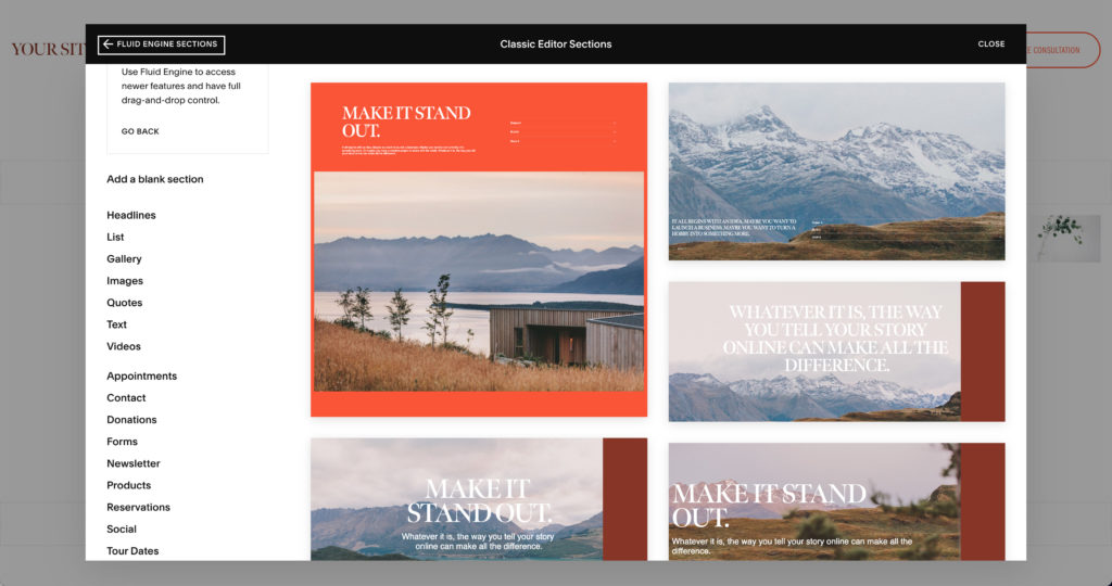
And, what you could or couldn't do with that section was largely determined by the template you picked.
So, if you wanted to do something that was different than was already on the template you picked it might take some coding OR you might have to look for another template that could possibly accomplish what you're looking for.
If SquareSpace doesn't have a template with what you're looking for be prepared to learn a little bit of web development.
Columns and Layout
Typically, those templates had a specific number of columns that you could move different elements around to.
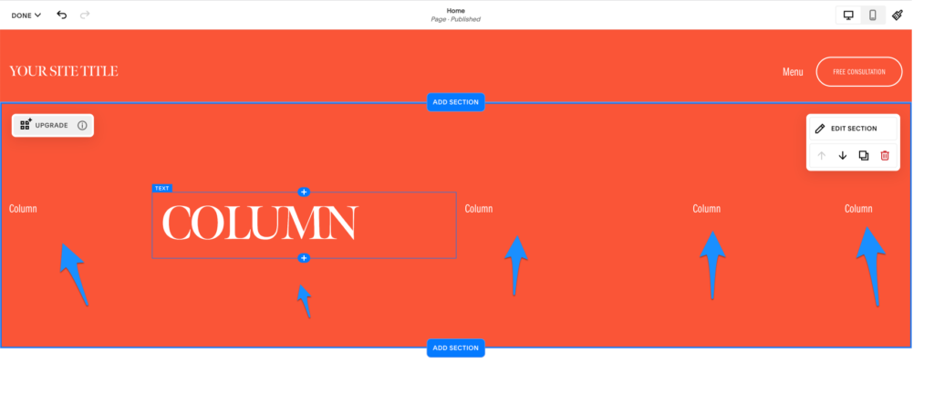
So, if you wanted an image on the section to be on the far right BUT it was on the far left, you could drag it over and drop it in the far right column.
I think the max number of columns you could have on a section was 12 which is pretty standard when it comes to web design. BUT, you couldn't add columns to a layout. Whatever it came with is what you got.
You could make each column bigger or smaller in width up to a certain point.
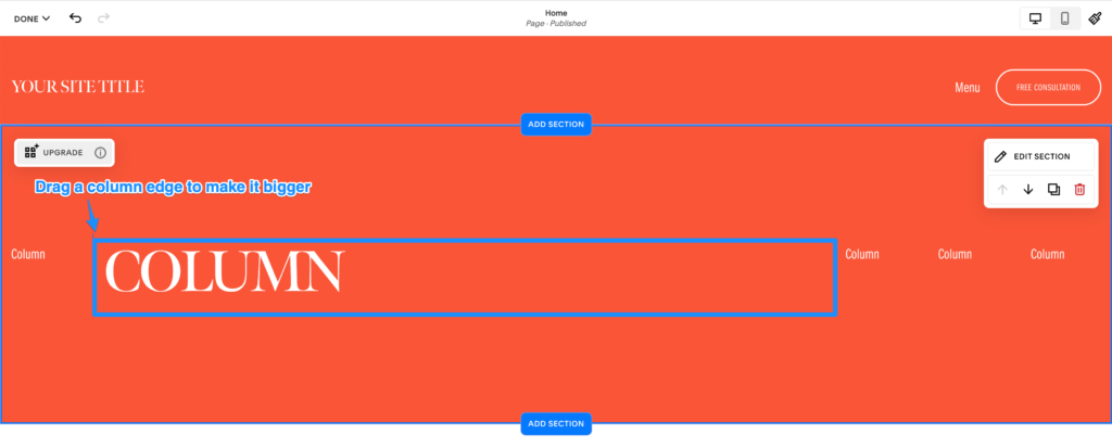
I say up to a certain point because you're somewhat limited by how many other columns there are on the section and how big those columns are. In other words, you can't just make a column's size 2 pixels. The space is shared as evenly as possible with all the other columns.
You couldn't adjust the height of a column because the height of a column was determined by the added-up height of all the elements in that column.
So, if you had a column with 3 pictures that were 100 pictures in height that column would be 300 pixels.
Adding Elements
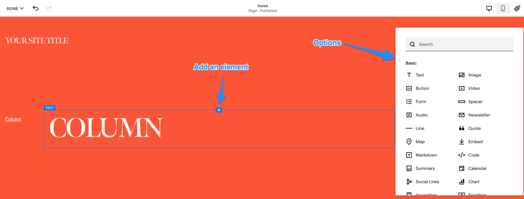
To add something that wasn't already there from the pre-built section, you just click the add icon that shows up when you hover over a section.
When you do that a big list of options will show up and you can choose from whatever you find there.
Mobile Editing
In the classic SquareSpace editor you had no option to edit the look and feel of the mobile layout differently than the desktop layout.
SquareSpace just kind of automatically made decisions for you based on how you set things up on the desktop side. Sometimes those decisions worked out and looked fine.
Other times (read: a lot of times) you'd have to bust out some code to get them to work right.
Updates to the Editor with the SquareSpace Fluid Engine
With the update to the SquareSpace Fluid Engine a lot of how you could place elements on the page changed.
Instead of having up to 12 columns that you could make larger or smaller.
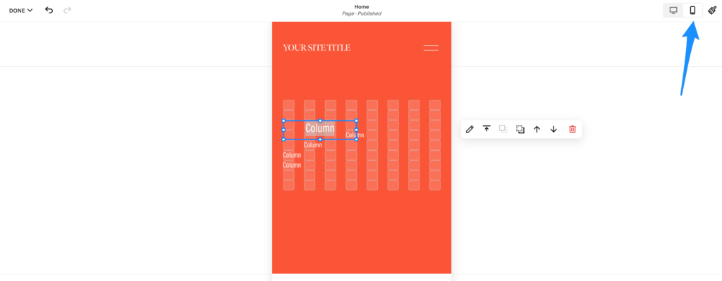
The big picture: you have a bunch of rectangles that form a grid and can have more or less space between them depending on what you choose.
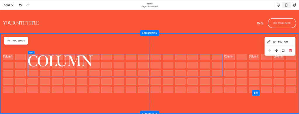
You can increase the number of rows on a section BUT you can't increase the number of columns.
You can add rows by clicking the “Edit Section” button and then increasing the row count, OR if you move an element (now called blocks) below the set number of rows it will automatically add rows based on how far you pull it down.
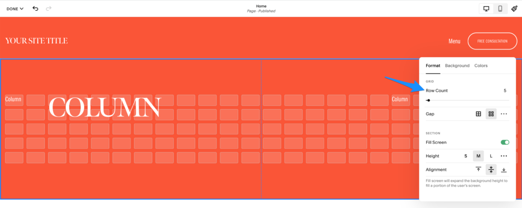
You've got some more flexibility with the elements themselves.
You can pick up each element or block and move it anywhere you want it on the grid or those little faded white rectangles.
It's now possible to have elements overlap. If you wanted that before SquareSpace Fluid Engine you'd have to bust out a little CSS aka code.
You can also change the size of each element rather than just the row.
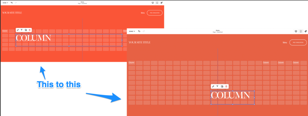
You still, technically, can't just drag and drop any element wherever you'd like.
For instance, the edge of an element/block couldn't stay on the middle of a grid rectangle. SquareSpace would snap it to be flush with the closest rectangle on the grid.
You can kind of finagle it to make the content INSIDE the block to be a different size than the block itself OR you could mess with the size of the gaps between each rectangle gird to get your content to be close to where you want it.
But, it's not as simple as:
- Picking up an element
- Moving it somewhere
- Putting it down
- It being exactly where you wanted to put it
So, technically they just increased the size of columns you could have to 24 and gave you that no matter what template you choose. BUT, it's still an upgrade in flexibility for you the user.
One big difference is you now have the ability to arrange the mobile layout differently than the desktop layout. No more leaving it up to SquareSpace to decide how your mobile experience will look.
Showit vs. the SquareSpace Fluid Engine
Showit's drag-and-drop experience has always been pretty fluid. 🌊 Sorry not trying to be on the nose here.
But, creative freedom has always been our goal.
We've wanted to put the power back in your hands, the user, and take away as many obstacles to getting your website to look exactly the way you want it to look.
No Columns or Grids, Just Drag and Drop, Really
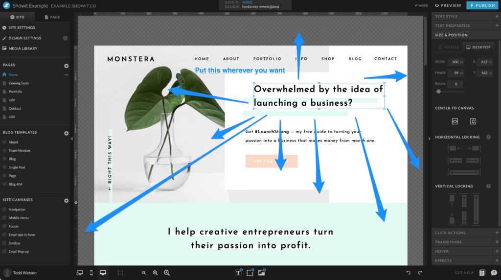
With Showit, there aren't any columns or grids you've got to worry about.
If you want to move an element 1 pixel to the right, left, up or down you can without having to adjust any settings on the section itself.
Just grab the element. Move it wherever you want. Let it go and there it stays exactly where you put it.
It won't snap back to the closest column or rectangle. It just stays.
Mobile and Desktop Editing on Fluid Engine
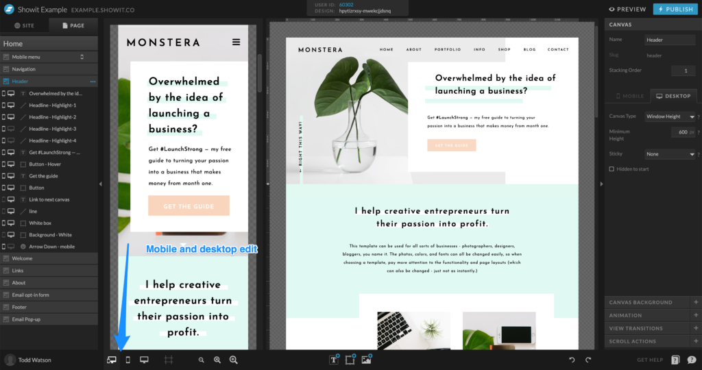
We've also always had the ability to adjust the mobile layout completely differently than the desktop. You can change absolutely everything on mobile from how it is on its bigger brother.
You can even edit the mobile and desktop view at the same time rather than having to switch back and forth between one or the other.
Transforming and Placing Elements
With Showit, you've got a bit more flexibility with what you can do with elements.
First, you can rotate elements however you'd like.
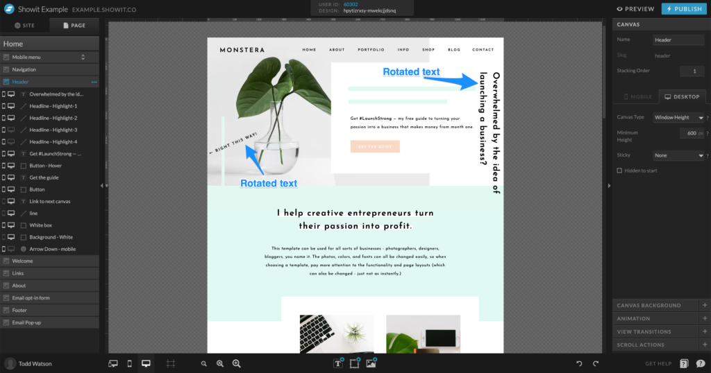
You can also have elements overlap other sections.
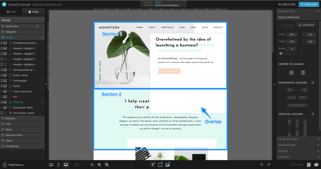
From what I could tell, the only way to do that on SquareSpace was with a little bit of code.
The Reasons Behind the Differences in Showit and SquareSpace Fluid Engine
So, there you have it. The updates made with SquareSpace fluid engine and how it's different than Showit.
But, as you're deciding which is right for you I think it's important to consider the REASON behind those differences.
After all, SquareSpace will likely update its editor in the future and Showit is always working to roll out new features in our app. You don't want to pick one and then be frustrated later on when an update comes out that completely changes things in one direction or the other.
The best way to avoid that is to try and find the reasoning behind the app features.
SquareSpace Fluid Engine and Purposeful Limitations
From the get-go, SquareSpace has padlocked certain things you can and can't do with its platform.
And, to be honest, I get the reasoning behind that.
A lot of people don't want to fiddle around with the details of their websites. They want something that just kind of makes creative decisions for them.
“Don't bother me with the details. I just want to get a website up that works.” SquareSpace builds its app for those kinds of folks.
As a result, you'll notice that most SquareSpace sites feel a little boxy or Geometric. Now, do you get why they named themselves SquareSpace?
Here's a list of templates that SquareSpace gave me to choose from.
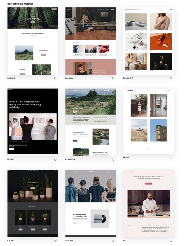
The rest of the template options look pretty similar. Square or rectangle images with different fonts and colors lined up verry mathematically.
If you want to do something too far outside of that you'll have to use some code.
Showit and Creative Freedom
Showit on the other hand was built on the foundation of trying to remove as many roadblocks to creative freedom as we can.
We want you to be able to tweak as much as you want as often as you want.
Todd Watson, our founder and CEO, has said,
“At our core, we believe that technology is best when it enhances creativity.”
That's our goal and that's the framework that we view the decisions we make about our website builder.
When we're adding new features we ask ourselves “Will this allow people to be more creative with their website?”
Check out this template from our design partner Elizabeth McCravy called Taylor.

Overlapping sections. Rotated images, less geometric layout, and elements that aren't forced to fit inside of a grid.
Could you accomplish this with SquareSpace? Yes.
It would just take extra work and likely some coding knowledge because that's not what SquareSpace was built for.
How to Choose Between Showit and SquareSpace Fluid Engine
So, with all of that in mind, you've got a decision to make.
And, really, it all comes down to the kind of person you are and what you want your website to do:
Do you want
A. More creative control and the ability to get your website to be exactly what you want?
OR
B. Limited control over your site but you don't mind SquareSpace making the decisions for you?
Hear me out. Neither of these choices are wrong!
Personally, I'm the kind of folk that loves having the ability to get something to look the exact way I want it to. That includes my website.
But, maybe that's not you.
Maybe you want a website because everyone says you need one and nothing more. You don't consider it a big part of your business and good enough is good enough. Then SquareSpace is for you!
We at Showit believe your website can play a bigger and different role.
It has the potential to be one of the biggest sales engines for your business. But, not if it takes you forever to get it to do exactly what you want it to.
That's why we want to give you the ability to tweak it to exactly how you want it without having to know code or spending a lot of time learning our platform.
That has been and will always be the driving factor behind the decisions we make.
So, there you have it, folks.
The updated SquareSpace Fluid Engine head to head with Showit.
Did SquareSpace win in the 4th round by way of KO (Knock Out) or is this going to be a fight that comes down to the judge's decision?
You get to decide.
Okay, I realize I told you no more boxing references and then I went and did it again 😂

Chris is multitalented, being able to play a number of instruments, and having an inclination towards creative design, AND technical know-how. He cheerfully brings his Swiss army knife of skills to our designer community.
