Load Newsreader Bold Font
Pro-Tip: if you're building a website you need a few good places to find website inspiration that help give you a starting place for your own awesome ideas.
A lot of people think they need to come up with some original and groundbreaking website idea out of thin air.
Here's the truth: creativity doesn't work like that.
If you're going to come up with something truly “original” you need to first become a student of what's out there.
A Lesson from All the Songs I Wrote That Sounded A Lot Like Coldplay
Before I started working at Showit, I got paid to play music. Some people even paid me to help them write songs.
But, I didn't start out making the kind of music that people wanted to pay me for.
In fact, it could be said that a lot of people would have paid me NOT to make music in those early days. If you don't believe me, ask my sister who would literally beg me to stop playing my guitar 😂
So, how did I get better?
I consumed music non-stop, all the time, every day.
While most of my friends were doing stuff normal kids do, I was tucked away in my room listening to the latest album from all sorts of bands.
Hours on end, I would analyze every note and every lyric.
This was when CDs first hit the scene. So, while listening, I'd be looking through the CD sleeve to see who wrote the songs, who produced them, and who played drums on track 11 because those beats were fire.
And, at first, a lot of the songs I wrote sounded like a lot of the bands I was listening to most.
But, over time, I started to develop my own style and would go on to write some half-decent songs of my own.
But, without first finding music that inspired me that was written by someone else, I would have gotten nowhere.
Finding Website Inspiration Online
I'm not saying you need to devote 1,000's of hours to studying other people's websites in order to make a good one yourself.
BUT, I am saying if you're trying to come up with creative web design ideas you don't have to start from a blank slate. IN FACT, you shouldn't.
You should have a few places that you can go to find website inspiration that helps stir your own creative juices.
HEAR ME OUT: I'm not advocating finding something and then copying it. That's not creativity. That's plagiarism.
Use these online portfolios as a springboard for your own personal spin.
Here are 16 places that I always go to when I'm looking for website inspiration.
1. The Showit Design Marketplace
The Showit design marketplace is a great place to find inspiration for all kinds of sites.
Now, this being a Showit blog, obviously, I'm a little biased 😂
I love our Showit Design Partners and think they're some of the best out there. AND, I think they make some of the best templates.
Heck, you may even find a website template that fits you and your business perfectly and not even need to make one from scratch!
But, I do love looking at all the designs for inspiration as well.
There are over 300 different designs to look through NOT JUST FOR PHOTOGRAPHERS.
There are sites for podcasters, bloggers, coaches, educators and on and on.
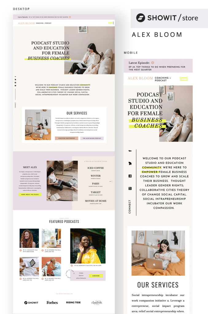
Check out this template from Tara Mosier of Oregon Lane Studio. It's a great website inspiration for a podcast site.
We're consistently adding new templates, too! So, check back often to find a springboard for your website.
2. Maxi Best Of
Maxi Best Of was started and is run by Bertrand Bruandet which is an amazing name to have. I can honestly say I've never seen a name that was so close to having all the same letters in the first name in their last name as well 😱
Bertrand is a true appreciator of good web design. A web design connoisseur if you will. And, he's created a site that will provide tons of website inspiration for your next project.
There's even a section devoted to the Typefaces used on different websites.
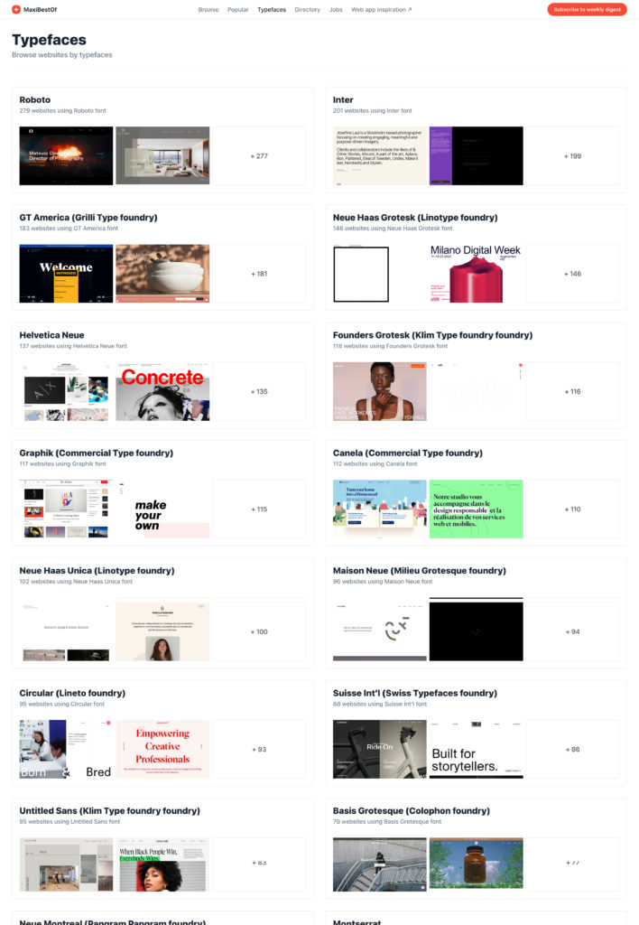
And, in web design, Typeface is kind of a big deal.
But, with Maxi Best Of You get to see how different fonts were used in different settings which can be super helpful when you're working on a project of your own.
It's hard to know how certain fonts will look in different scenarios unless you can just, quite simply, see it in action. A lot of times that means you've got to mock things up or play around with different typefaces until something works.
This little goldmine of a section could save you a lot of time.
3. UI Jar
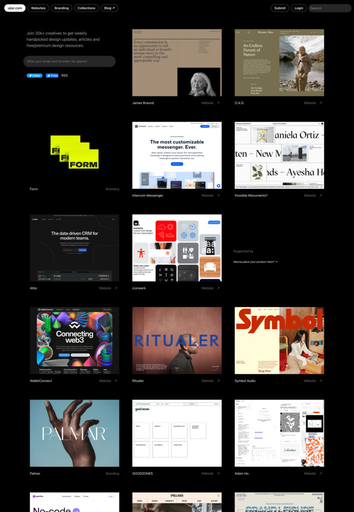
One that's probably one of my favorites but likely a little bit edgy is UI Jar.
UI Jar is run by Öykün Yılmaz who is the senior vice president of design for JP Morgan and all of the designs featured here are hand-picked by him.
With that said, there aren't tons of new sites all the time BUT what's here is really good. There's even a section for branding which can be super helpful if you're doing a branding/web design combo.
4. Land Book
Land Book is a website inspiration curation (does that sound like the beginning of a Willy Wonka song to you, too?) started by Dawid Liberadzki.
It's got a pretty simple design and layout which is nice AND you can create an account to save screenshots if you so desire.
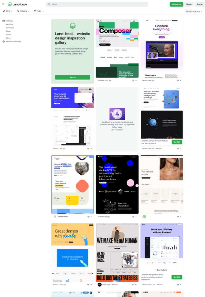
You'll find new website inspiration daily according to Dawid. So, check back here often for some new, fresh material.
5. One Page Love
Another one of my go-to places for website inspiration and dare I say my secret weapon is One Page Love.
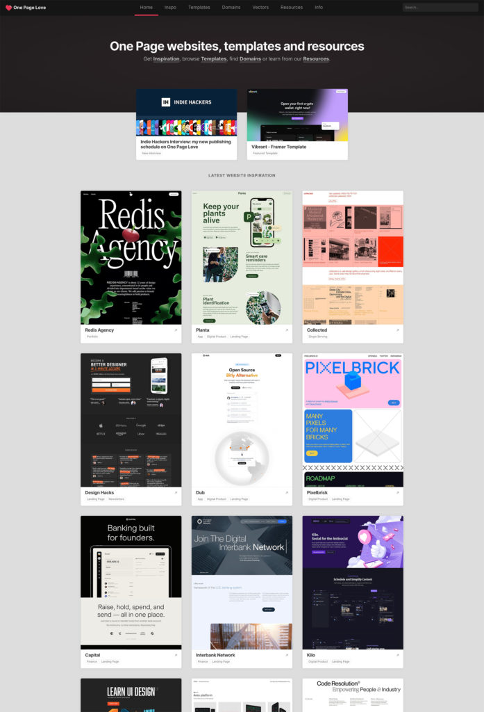
One Page Love was started by Rob Hope who now runs One Page Love for one-page website inspiration, Email Love for email design inspiration AND UX Love for all the UX designers out there (which at the time of writing this article hasn't officially launched yet BUT ROB, if you're reading this, we're looking forward to it).
One Page Love provides a fresh set of sites to browse through and find ideas for your website on a pretty consistent basis.
It says it's only for websites that are one page BUT you'll find some full-fledged multi-page websites on there.
AND, of course, even if it is just a one-page website, that doesn't take away from the fact that these sites are killer and will offer the creative boost you might need for your next project.
You can even browse different sites by their industry.
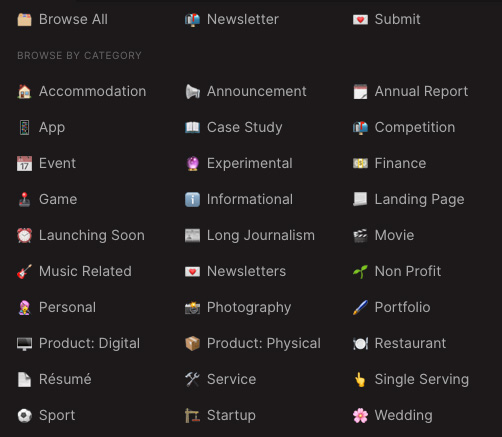
I've personally found a good deal of websites that I've swooned over and used to help me create sites for personal projects or clients.
6. Lapa Ninja
Lapa Ninja is another great place to find website inspiration for your next project started by a designer named Tinh Nguyen.
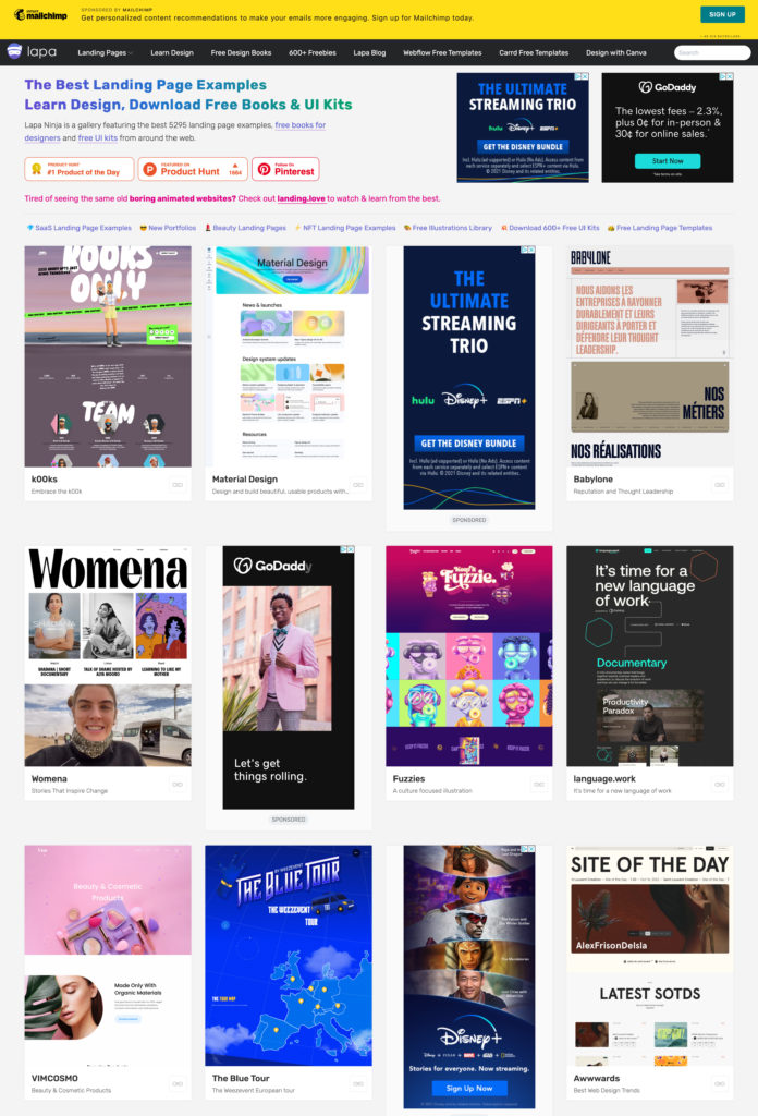
There are even some great resources to learn design. So, if you're a budding designer this would be a great place to check out.
When Lapa Ninja originally started it was hosted on Tumblr. Do you guys remember Tumblr!!!
Wow, how things have changed.
Lapa Ninja has a lot of new designs to look at on a pretty regular basis. The only problem is there is SO MUCH ADVERTISING.
We're talking tons.
Listen, I get it. You gotta make money somehow. But, sometimes I wonder if anything on there isn't somehow tied to monetary promotion 🤷🏼♂️
Despite that, the designs are great and it's a fun place to peruse.
7. Awwwards
No that's not a typo. There really are 3 w's in the name of this website inspiration platform. It's kind of a fun take on the www you type before a website URL.
This is the first of our options that aren't just curating different things to look at.
What makes it on this site has been vetted and voted for by a panel of judges.
Consider this the Grammy's of website design 😉
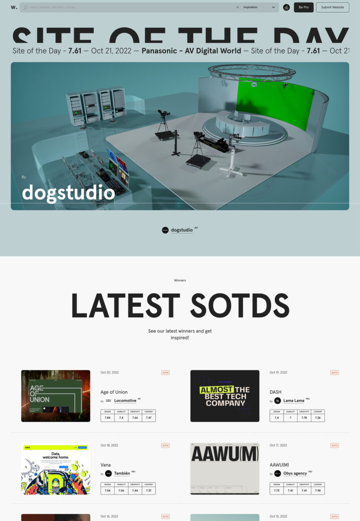
Awwwards has become a behemoth of a resource for web designers. They've got courses, conferences, and articles AND you can become a “pro” member which gives you access to exclusive content.
It's easy to get lost in both the pretty websites AND great resources. SO, be careful when you come here 😉
8. CSS Design Awards
The next place on our list of website inspiration resources is the CSS Design Awards which started in 2009.
This is similar to the Awwwards platform BUT my guess is that it likely started as a way to highlight cool stuff that was being done with CSS and then it just kind of morphed into being more design-focused.
However we got here, I'm glad we did. There are a ton of great projects to look through AND they've been curated and vetted by a group of different judges. SO, it's not just one person's preference.
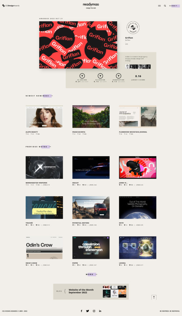
There are a lot of great sites to look at. AND, You can fine-tune what you're seeing down to industries AND even certain design aspects like color.

Take a peek. You won't be disappointed.
9. Behance
One website inspiration resource that you might have heard of before is Behance. Behance is like Adobe's Instagram for creative people.
If you use anything that Adobe offers (Photoshop, Illustrator, Light Room, etc) then you have a Behance account. Just log in with your Adobe credentials and you'll be set.
Basically, anyone and everyone can upload their own projects to Behance for all the world to see. Some designers even use Behance as “their portfolio website.”
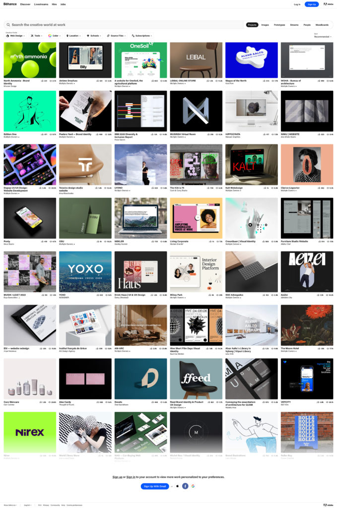
There's a lot to filter through here AND you won't always find awesome stuff. BUT, you won't be hard-pressed to see examples of websites that will help you as you build what you're working on.
PLUS, there's a lot of inspiration from other mediums of design which can actually be pretty helpful when you're working on a website.
10. Dribbble
Dribbble is another standard for designers showing off their portfolios.
It's another instance of finding a lot of different design mediums under one roof BUT being able to quickly filter to the one you're looking for which in our case is website inspiration.
There's even a tab at the very top where you can select “Web Design.” So, they make it easy.
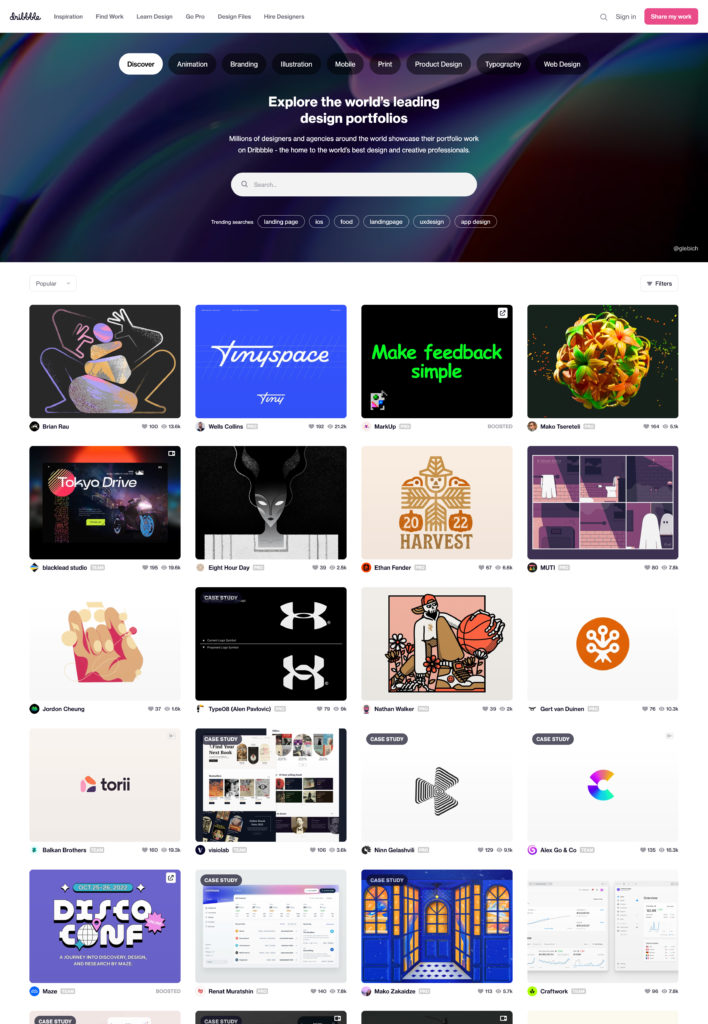
If you'd like, you can sign up for an account and kind of curate the types of portfolios you're seeing BUT you're still able to look around without signing up.
The only downfall of Dribbble is that it's sometimes hard to get a good idea of what the design of a full website would look like because you're only getting a small snippet because of the image size limitation Dribbble gives its users.
In other words, a lot of times you'll only see the first couple of sections of a website.
BUT, it's still a good place to come for ideas. AND, sometimes people upload a full page that you can access once you click on a post.
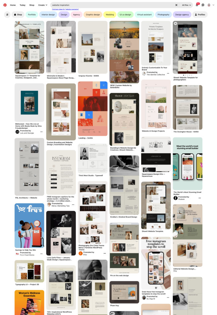
11. Pinterest
Pinterest is the end all, be all of pretty much all images on the internet. You can find everything from DIY instructions on installing a new bathroom vanity OR for our purposes website inspiration.
When I first started building websites, I pretty much looked exclusively on Pinterest. Which, back then, not a lot of people were using it for much more than pinning their favorite cookie recipes.
It's come a long way since then.
Be careful here! Pinterest has a way of tailoring what you see based on what it thinks YOU WANT to see. So, often times the stylistic selection will be limited to your most recent searches.
It changes pretty quickly if you start looking up different styles BUT it's possible you'll see the same sites over and over if you're not careful.
12. Muz.li
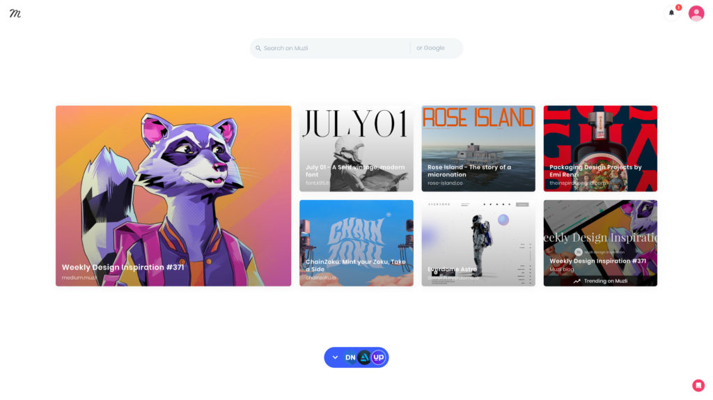
My next suggestion isn't necessarily a website NOR is it just for website inspiration. BUT, a lot of the things you'll find with this tool will definitely be helpful for your next website project.
I'm talking about Muzli whose name I can only assume is derived from the word “Muse.”
In Greek mythology, a Muse was the daughter of Zeus who presided over the arts or in today's terms someone or something that inspires creativity within you.
Well done Muzli. Great name.
Muzli is actually a browser extension or plugin that you can add to Safari or Chrome.
When you do that, any time you open up a new tab you're hit with fresh design inspiration every time. AND, if you feel like it, you can scroll down to find even more inspo.
13. Designspiration
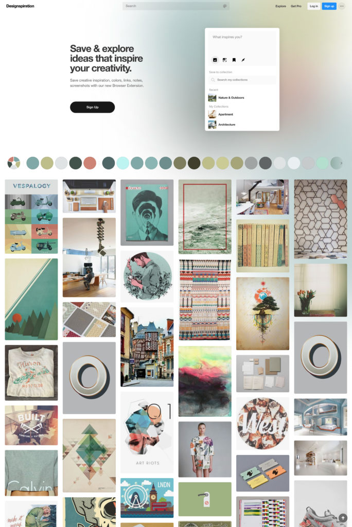
For the next website inspiration destination (ha did it again!) you will need to have an account. BUT, the account is free and it enables you to save different ideas to your account.
I'm talking about Designspiration which could be short for Design Inspiration or Design Perspiration. Either works BUT I really hope it's Design Perspiration 😅
You will find all sorts of different design mediums presented here mainly in the form of graphic design. BUT, it's easy to bridge the gap between graphic design and web design. So, there are definitely some gems you can use while building a website.
14. Brutalist Websites
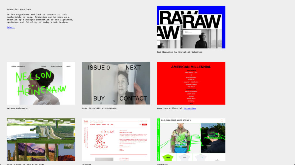
If you're looking for some off-the-wall website inspiration, I'd like to introduce you to Brutalist Websites.
Brutalism is a term that has historically been used to describe a type of architecture. However, nowadays people use it to describe a type of design used for websites.
Brutalist Websites is the artistic community's answer to the “minimalism” craze.
If you're a professional web designer, you've likely been told by clients that they love “clean and minimal designs.” If you are looking to build a site yourself, you've likely thought, “I really want my site to feel clean and minimal.”
And, hey, that's great!
I love a good minimalistic feel. BUT, like design always does, the zeitgeist is starting to shift. In other words, younger folks are starting to get tired of minimalism.
This is no better personified than in the website inspiration you will find at Brutalist Websites.
15. Hover States
Down the rabbit hole we go even further with Hover States.
Hover States is a pet project from Mike Guppy and Dan Powell. This is another batch of “off the beaten path” websites that have cool/different animation.
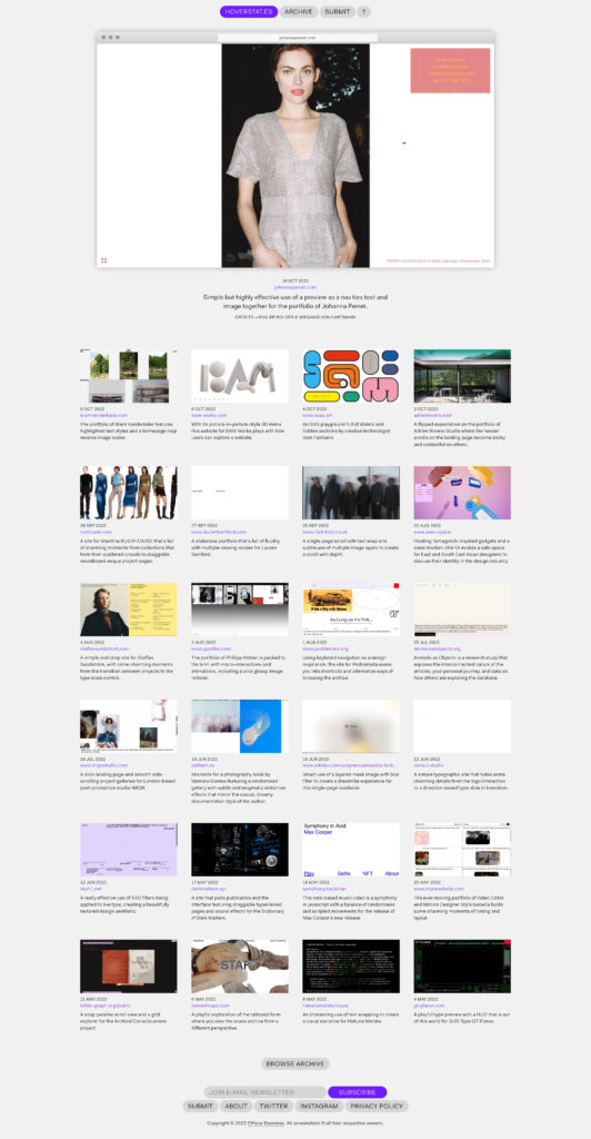
Listen, you might not ever use what you see here in your own designs. BUT, what I've found is that when I feel stuck in a design rut, I need some help thinking outside of the box. AND, designs like the ones I find here help me do that.
So, come here when you're looking for something edgy OR you're trying to break out of the “same-ole, same-ole.”
16. Design Books
Finally, we come to a source of web design inspiration that might seem a bit weird. I'm talking about plain ole books.
“HOW!” you say, “Can you find website inspiration from a book!”
Well, my friend, sometimes you have to stoke the fires of creativity in one medium through a completely different medium.
Website inspiration is actually all around you. Trust me on this one. I'm not just getting super metaphorical, college art teacher on you.
You could be inspired by something you saw on television OR a piece of art.
And, if you want to do something different than everyone else, you just might have to look in places that no one else is looking.
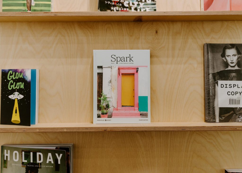
SO, try looking through some books. A good starting place is our very own Spark Creative Inspiration Anthology.
We took 50 of our favorite websites and put them in a book for you to flip through and be inspired. Best news, you can download a digital copy for free right away.
Website Inspiration Isn't Hard to Find
Sheesh, that's a lot of places to find website inspiration.
The good news is you'll never run out of some pretty awesome inspiration to help you build a website that helps you or your client really stand out.
So, now the only question is which website builder are you going to build it?
May I suggest the best one out there 😉

Chris is multitalented, being able to play a number of instruments, and having an inclination towards creative design, AND technical know-how. He cheerfully brings his Swiss army knife of skills to our designer community.
