Load Newsreader Bold Font
Have you ever visited a website and just felt…well…lost? Either you can't get to where you want to go, or you can't get back to where you came from? This is a common problem when building your own website, but where do you begin? Enter my favorite organizational tool: the visual sitemap.
When I first begin working with a client, I always have them give me a list of pages to be included in a visual sitemap. The sitemap ensures that we are on the same page with regards to the natural flow of their website from page to page, and can also make certain that no pages get lost along the way. I begin by having them submit a list to me, something to the effect of:
- Home
- About (2 pages: bio, likes)
- Galleries (3 galleries: weddings, engagements, featured)
- Etc.
From there, I can generate a visual sitemap and make suggestions as to the flow of the site, and I can also immediately determine if any secondary navigation is needed. Secondary navigation can be used in the form of dropdown menus, extra navigation links that appear in a style group when a visitor gets to a section (such as an information section), or simple arrows that guide a visitor back and forth between various pages in a section. Again, this type of intuitive navigation will make sure to help your visitors stay on track and not get lost in your site, get frustrated, and ultimately leave and go somewhere else.
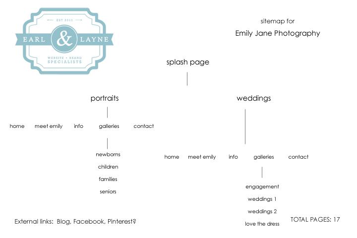
Here is an example of a sitemap that I created for Emily Jane Photography:
You can see how the sitemap was implemented on her website: http://www.emilyjanephoto.com
A general rule of thumb when working on your site navigation is to place your links in the order that you want potential clients to visit them, from left to right, or from top to bottom. You can see that from the sitemap above to the website, we decided to have visitors go to the galleries before the information on the final site to help them become more invested in the photographer's work before getting to all of the details of the packages and pricing.
Think of your website as a building and the navigation as the building's directory.
Links that take visitors away from your site, such as blog and social media links, might be best placed at the end of your navigation, after your contact form. This strategy typically aids in directing your client to contact you prior to exiting your site, at which point they may get so involved that the contact never happens. The goal is for every visitor to your site to end up wanting to contact and/or book you, so definitely try to avoid this pitfall!
Visitors to your site are not the only ones who will benefit from sitemapping and careful planning, Google and other search engines will as well. When you publish your Showit site and export your HTML files, a file called sitemap.xml is also exported along with your HTML pages. This sitemap file aids search engines in knowing how your pages are linked together. Well mapped sites that have no broken links are more likely to be indexed higher on Google than sites that have superfluous pages, or broken links.
Here are some great examples to check out of well-organized Showiteer websites:
With careful planning, you can organize your site to help visitors navigate through your site effectively! Do your website links need a spring cleaning?
Rachael Earl is the owner and lead website designer at Earl & Layne, and is a Showit Design Partner. She has been using Showit to design websites and online identities for creative professionals since 2009, and is also a professional photographer. Rachael has been married to her amazing husband since 2000, and they have 4 incredibly adorable offspring together. They call Gilbert, Arizona their home, which is affectionately and alternatively known as "the surface of the sun."


