Load Newsreader Bold Font
Every homepage you build has one job. Get the right people to take the next step, whether that’s signing up for a service, buying a product, or joining your email list. It sounds simple, but most homepages miss this because they’re built section by section with no real plan for how each part works together.
Chris, one of our in-house Showit designers, uses a repeatable five-section homepage layout formula on every homepage he builds. This guide breaks that formula down section by section, so you can build your own homepage with the same structure.
Table of Contents
- The Hero Section: Your First and Most Important Impression
- The Stakes Section: What Happens If They Don’t Take Action
- The Value Proposition: Why This, Why You
- Social Proof: Turning Skepticism Into Trust
- Urgency: Turning “Maybe Later” Into “Yes, Right Now”
- Where to Place Your Call-to-Action Buttons
- FAQ: Homepage Layout Formula
- Building Your Homepage With This Formula
The Hero Section: Your First and Most Important Impression
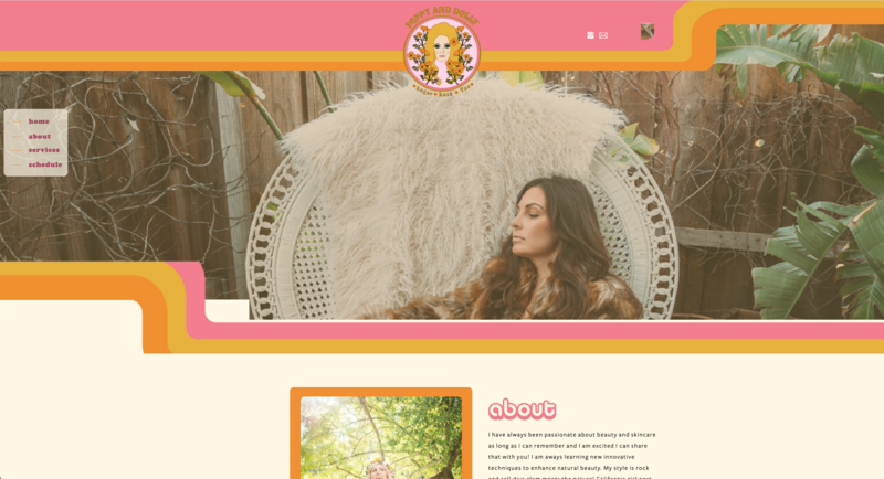
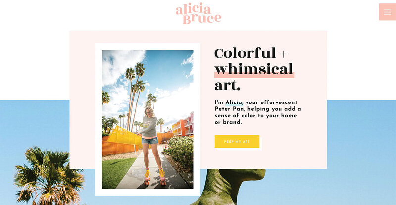
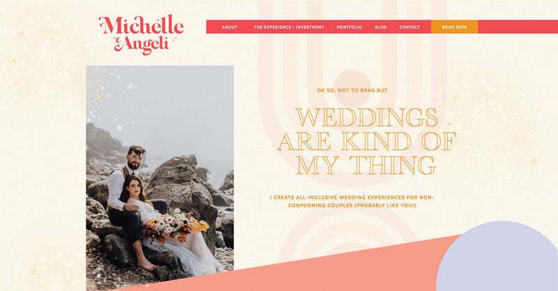
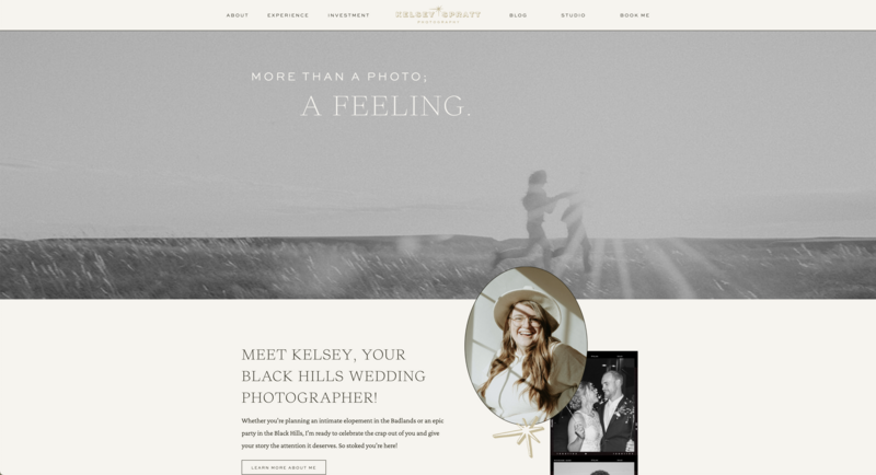
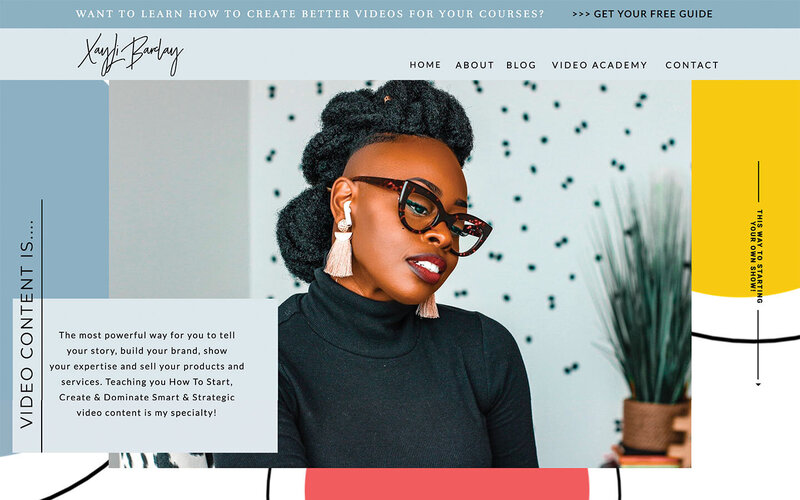
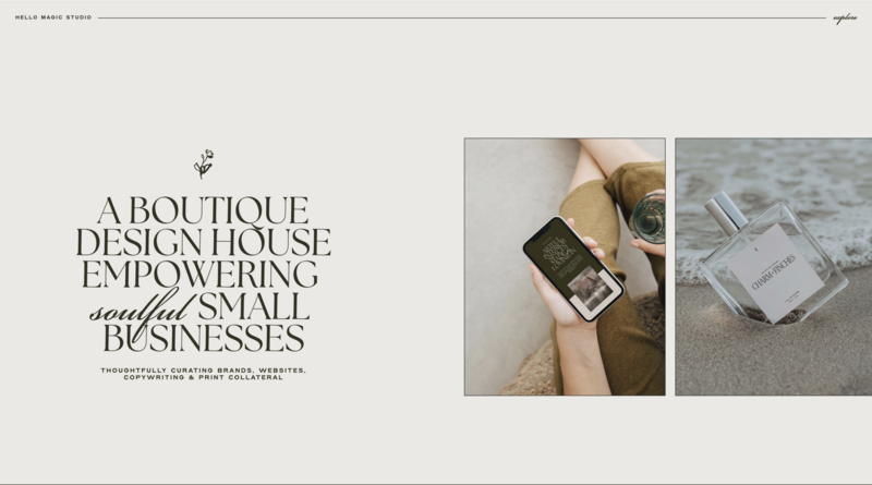
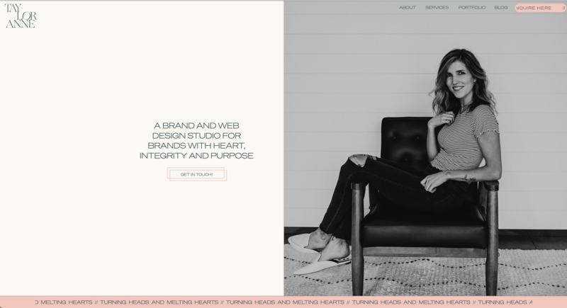
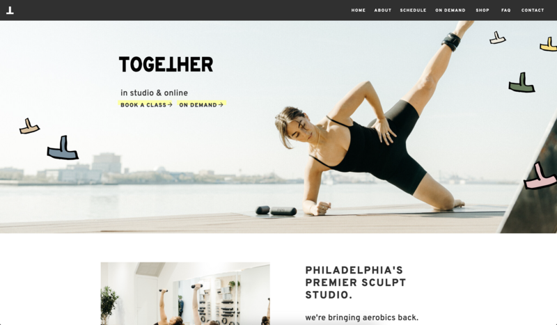
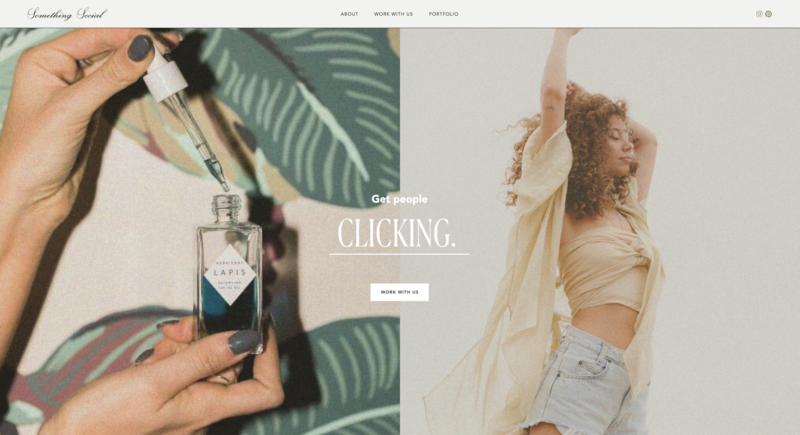
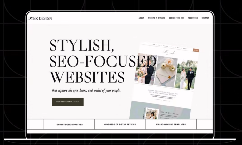
The hero section is the first thing a visitor sees when your page loads, and it carries more weight than any other part of your homepage. Eye-tracking research from the Nielsen Norman Group found that users spend about 80% of their page-viewing time above the fold, which means only around 20% of their attention makes it to the rest of the page
That makes your hero section the place where most of your work happens. A strong hero section covers three jobs.
The header should tell visitors exactly what they’re getting, in plain language, within a few seconds.
The subheading adds motivation or context, giving people a reason to care.
The call-to-action button gives them one obvious next step, not five different options to weigh.
Chris’s rule here is simple. If someone reads only your hero section and nothing else, they should still understand what you offer and what to do next.
The Stakes Section: What Happens If They Don’t Take Action
Right after the hero section, Chris adds what he calls the stakes section. This isn’t about the meal, it’s about what’s actually at stake for the person reading your website.
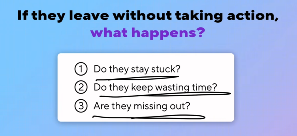
Think about what happens if a visitor leaves without saying yes. Do they stay stuck in the same spot? Do they keep losing time or money doing things the hard way? This section brings those consequences into view so visitors feel the cost of doing nothing, without ever feeling pushed or manipulated.
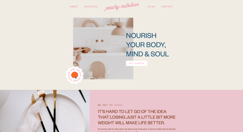
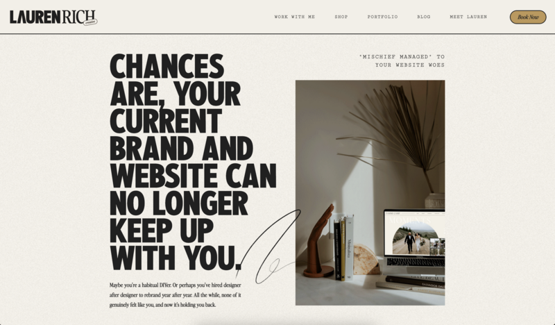
Franklin & Willow does this well with lines pulled directly from real client conversations, including an admission that they were embarrassed to share their own website link. Lauren Rich Creative takes a similar approach, telling visitors that their current brand and website can no longer keep up with them. Both examples make the same point. The problem isn’t the visitor, it’s the outdated tool they’re using, and there’s a way forward.
The goal of this section isn’t pressure. It’s clarity. Help people see what happens if nothing changes, and let that clarity do the convincing for you.
The Value Proposition: Why This, Why You
Once visitors understand what’s at stake, they’re ready to hear what you actually offer. This is your value proposition, and it needs to answer two separate questions.
The first question is why someone should spend money on this at all, instead of spending it on anything else competing for their attention or budget. The second question is why they should choose you specifically, instead of someone else offering something similar.
These are different questions with different answers. The first is about priorities, which is why the stakes section comes before this one, it reminds visitors that this actually matters to them. The second is about differentiation, and answering it usually means taking an honest look at what your competitors offer and figuring out what’s genuinely unique about you.
Chris uses a simple structure to make sure a value proposition covers everything it needs to.
What you offer. State clearly what the product or service actually includes. Bullet points or short blocks of text work well here.
Why it matters. Add the “so that” behind the offer. This is what makes people pay attention instead of scrolling past.
What makes it different. Explain what sets you apart from anyone else selling something similar, without needing to call out competitors directly.
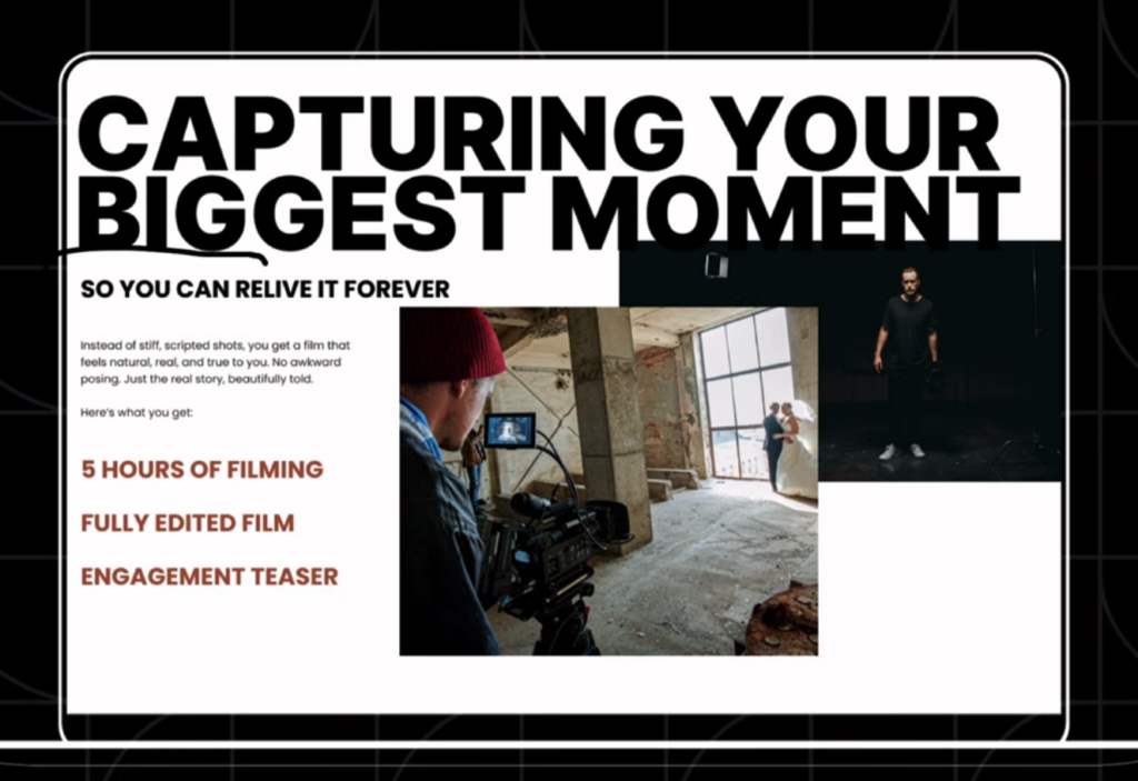
Here’s an example from a wedding videographer’s homepage. “Capturing your biggest moments so you can relive them forever” covers the what and the so-that in one line. Then, “instead of stiff, scripted shots, you get a film that feels natural, real, and true to you” answers the how, showing what makes this videographer’s approach different from anyone else shooting weddings.
Social Proof: Turning Skepticism Into Trust
By this point, visitors understand what’s at stake and what you offer, but they might still be wondering if it will actually work for them. This is where social proof comes in.
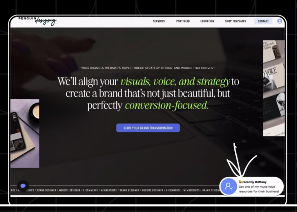
Testimonials, reviews, case studies, and recognizable brand logos all do the same job. They show visitors that other people already trusted you and got real results. A tool like Fomo takes this further by showing real-time popups when someone signs up or makes a purchase, tapping into the simple psychology that people are more likely to act when they see others already have.
Volume matters here too. A wall of testimonials from real clients builds credibility even if most visitors only skim a couple of them. Course creators often do this well, pulling screenshots of messages or comments straight from social media to show the product working in the real world.
One detail worth copying is pulling out the single most important line from a testimonial and highlighting it visually. Buffalo Collective does this by calling out a client’s line about doubling her annual revenue. Visitors are scanning your page, not reading every word, so make sure the most convincing parts of your social proof are impossible to miss.
Urgency: Turning “Maybe Later” Into “Yes, Right Now”
Once you’ve covered value and addressed doubts, there’s one more hurdle. Visitors can walk away thinking “maybe later,” and later usually means never. This section exists to help people decide right now instead of putting it off.
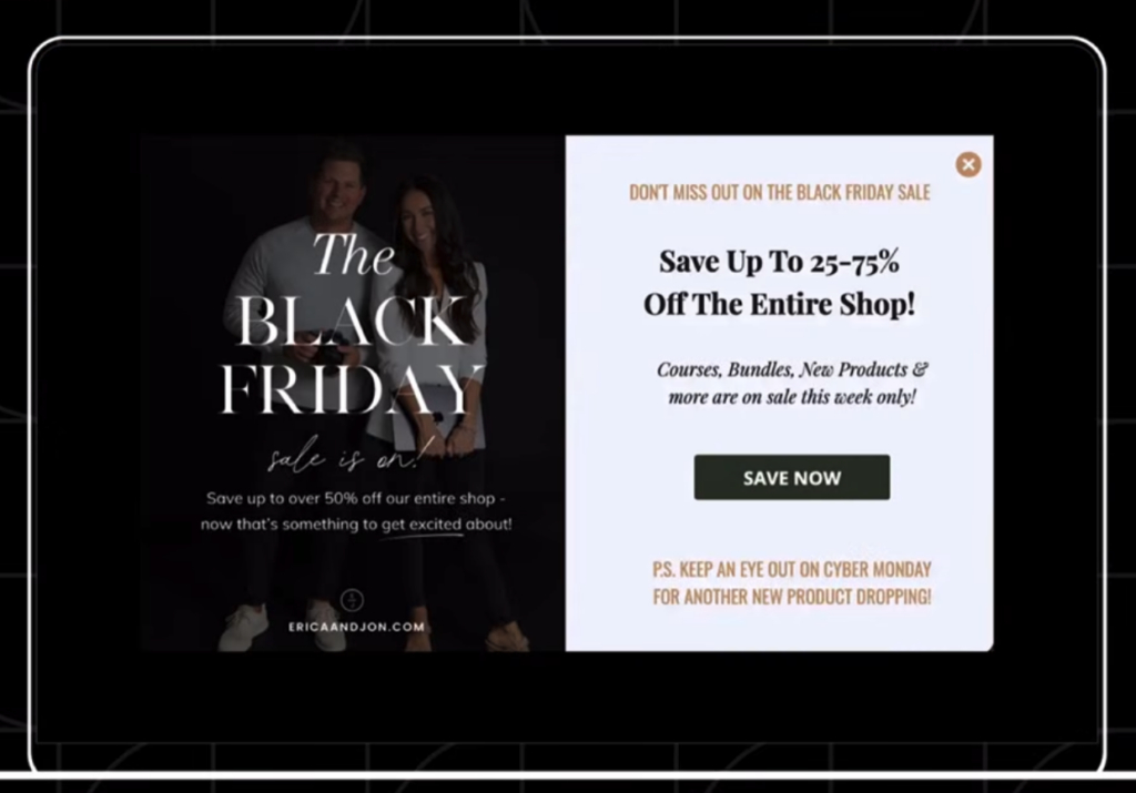
You don’t need a discount to create urgency, though that’s one option. A limited-time bonus, a countdown timer, or a scarcity message like “not booking until July” all work by giving visitors a reason to act instead of waiting. A wedding photographer might offer a free engagement shoot for anyone who books by the end of the month. A retail brand might offer 25% off in exchange for an email address, or run a clearly time-boxed sale like a Black Friday promotion.
The key is making the incentive specific and time-bound. Vague urgency doesn’t move people. A clear deadline or a clear bonus does.
Where to Place Your Call-to-Action Buttons
A call-to-action isn’t limited to a single button at the top of your page. Chris builds in a CTA roughly once every three sections, often pairing a short motivational line with a button that points to the next step.
You don’t have to follow the five sections in strict order either. A CTA can sit between the stakes and value sections, or between value and social proof, and these sections can be mixed and reordered depending on what your homepage needs. The one rule that matters is that if you’re only building five or six sections total, all five formula sections need to be represented somewhere on the page.
FAQ: Homepage Layout Formula
What is the most important section of a homepage?
The hero section carries the most weight, since eye-tracking research shows users spend around 80% of their time above the fold. If a visitor reads only your hero section, it should still make clear what you offer and what to do next.
How many sections should a homepage have?
Chris’s formula covers five core sections: hero, stakes, value proposition, social proof, and urgency, plus a CTA repeated roughly every three sections. Homepages can include more, but these five cover the ground every converting page needs.
Where should I put my call-to-action button?
CTAs work best spread throughout the page rather than placed only once. Aim for a CTA about every three sections, and don’t feel locked into a strict order. A CTA can sit between any two sections where it makes sense.
What is a value proposition and why does my homepage need one?
A value proposition answers why someone should spend money on this at all, and why they should choose you over similar options. Skipping either question leaves visitors unsure if your offer is worth their money or how you’re different from competitors.
Building Your Homepage With This Formula
Hero, stakes, value proposition, social proof, and urgency. Five sections, each doing a specific job, with CTAs woven in throughout. That’s the whole formula, and it works because it walks visitors through exactly what they need to know and feel before they say yes.
If you’re building your homepage on Showit, each of these sections works as its own section on the page, so you can rearrange, test, and refine the order as you go without starting from scratch. Start with the hero section, build out from there, and use this formula as your checklist for making sure nothing gets left out.

Sarah has been part of the Showit team for nearly four years, where she works as a copywriter crafting content that educates, encourages, and celebrates the creative entrepreneurs who make up the Showit community. When she's not writing, you'll find her with a book in hand (usually something about leadership or personal growth), cheering on Arizona sports teams, or connecting with people over a really good cup of coffee because, let's be honest, there's always a cup nearby. Sarah believes in the power of stories, the importance of showing up authentically, and that every entrepreneur deserves to be celebrated for the brave work they're doing.