Load Newsreader Bold Font
Website visitors are nice, but they don't pay the mortgage, do they? What's the trick to turning your website visitors into customers? The key is improving a little thing commonly referred to as the user experience (or UX). Perhaps you have heard of it, but have you ever considered just how much of a direct impact it has on whether or not your readers take action when they land on your website?
In other words: have you thought about how you can give your visitors PERMISSION to take action?
Cultivating a positive user experience for visitors is like providing them with a golden ticket. Great UX is the one thing they need to get through to the exact place you want them to end up. Whether that’s the other side of your inquiry form, the inside of your course, or the coveted spot on your email list—your user experience decides the visitor's golden ticket destination.

What is UX? (We promise, it’s not as techy as its acronym makes it sound…)
UX, or user experience, is a concept that is actually quite easy to understand, despite the techy-sounding acronym. In terms of website design, UX refers to the process of creating a positive, relevant, and meaningful user experience for your site’s viewers.
As the creator of your website—and a brand owner who cares about conversion—it’s important to prioritize the experience your readers have when they visit your website because it’s the #1 thing that impacts the actions they take (and the ROI you get).
By leveraging user experience optimization, you’re giving your users permission to purchase.
Or inquire, or sign up, or download—you get the picture.
A great user experience on your website is the EXACT missing link between Point A (“cool website, guess I’ll read it until I find a reason to X out”) and Point B (“ooh, I need that!”) that transforms your viewers into action-takers.
The best websites—aka the ones users want to spend their time browsing—are clear, credible, relevant, consistent, simple to navigate, and accessible.

Why user experience design is important
✅It improves your users’ perceptions of your brand’s trustworthiness, reliability, and overall quality.
✅ It ensures that your website will fulfill your users’ needs, which gives you a competitive advantage in comparison to other websites that aren’t as easy to use or as visually appealing.
✅ It keeps your users loyal to your brand because they’re consistently receiving a positive outcome every time they visit your website.
✅ It improves user engagement because users are much more likely to stay on your website longer and explore more pages if they’re having a seamless, enjoyable experience. (Especially if your site loads quickly & doesn’t make them wait to view the content they’re looking for!)
And, on the other hand, bad user experience has the power to drastically negatively impact your website—and your entire brand as a whole.
Bad UX completely repels clients, with “88% of customers saying they are less likely to return to a website after a bad experience.” (Trailblaze Marketing)
There are so many options available to users on the Internet that they don’t have to give you a second chance; one bad impression, and you could lose that user forever.
In providing a bad user experience, you run the risk of decreased user satisfaction, much lower conversions, increased support costs (hello, website redesign!), and much higher website bounce rates.
Plus, it’d be hard to keep up with your competition if your website isn’t up to par.

What makes for the best user experience on your website?
The #1 thing to consider when finalizing your website is to always put the user first, and consider what they’d need in order to have a positive, successful experience on your site.
When determining whether or not a website should get the green light for a positive UX, we love referring to the Usability Honeycomb:

Valuable: Provides your user with unique value they can’t find elsewhere
Findable: Content is easy for your user to find
Desirable: Design elements (like images and branding) are used to evoke emotion from your user and convey an overall message
Credible: Content must be trustworthy and believable
Accessible: Everyone needs to be able to access the content
If your site passes the honeycomb test, you’re golden! (And your visitors have the golden ticket!) If perchance you aren't, we got you…
6 Ways to Improve Your Website UX
There are lots of ways you can provide your website visitors with a positive user experience, resulting in a positive outcome for you.
If you’ve been following along with our Website Health Series, you know by now that optimizing your website for SEO, writing conversion-friendly, personality-packed website copy, and creating a beautiful, captivating website design are all extremely important factors in encouraging your readers to take action, but…
If no one can figure out how to navigate your website in the first place, none of those things will matter.
The good news, though, is that there are plenty of easy tweaks you can make to ensure that your readers have the best possible experience when they visit your website:
#1 – Prioritize directness and efficiency.
If someone is confused, they will not convert.
Imagine driving down a highway, in search of the restaurant you’re supposed to meet your friends at. You have to be there in 10 minutes.
But there’s an issue: you don’t know what the restaurant is called, you have no clue which exit to take, and you aren’t sure whether or not your friend made the reservation.
Think about it: are you able to take action when you don’t know which action to take, where to go next, or what will happen when you get there?
That’s how your website viewers will feel when they land on your site and see no rhyme or reason to the way your content is structured.

HOW TO DO IT: Think about what the reader needs to know about you and your brand from the second they land on your site all the way up until the decision to take that desired action.
What’s the typical order of events in this situation? What are the necessary steps they need to take—or information they need to consume—in order to do the thing you’re hoping they’ll do?
Now, take a look at your website (or ask an unbiased friend to do it for you!) and determine whether your content naturally directs them from one step to the next.
RELATED: How to Correct Your Website so it Converts Your Ideal Client
#2 – Make your website scannable.
Think about the last time you surfed the Internet in search of information. Did you read the entire web page? Did you consume every single word of the blog post?
No, we’re willing to bet you didn’t.
And even if you did—gold star for you!—we’re willing to bet that you still likely skimmed through the entire page before deciding whether or not reading every single word was worth your time.
Most people visit a given webpage to find answers. It’s your job to help them find those answers by making them as easy as possible for them to locate.
HOW TO DO IT: Avoid big blocks of text, and separate your copy with a good balance of headings, subheadings, images, and white space.
#3 – Add more buttons than you think you need.
Every user is different, and so are their levels of hesitation, patience, and readiness.
What will convince one user to make a decision may not be enough for someone else. Some people will read through your entire website before deciding if they want to work with you, while others will only read a line or two of copy before determining that you’re a perfect match.
If your goal is to inspire website users to take action, you’ll need to cater to both types of people—as well as everyone in the middle.
By adding more call-to-action buttons throughout your website, you’ll give each type of person an opportunity to choose YOU at any turn.
HOW TO DO IT: Take a look at each page of your website, and determine how far you have to scroll to reach an opportunity to take action. Was it a lot of scrolling?
If yes, consider adding a button to the end of each section, prompting your reader to take your desired action.
Here’s how to add buttons in Showit & here’s how to create a “back to top” button (another great tool for promoting a positive UX, because it makes your site easier to use/more accessible by speeding up the process of getting back to your navigation bar).
#4 – Make sure your navigation elements are exponentially clear.
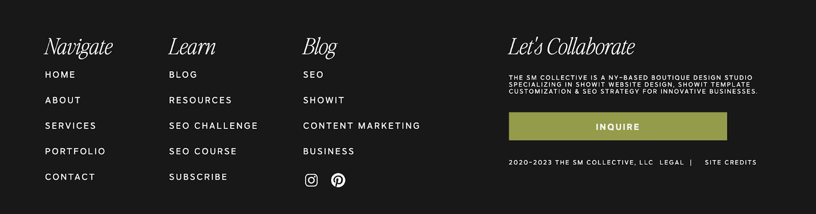
There should be absolutely 0 confusion about how to find the core pages of your website (Home, About, Services, Contact, and Blog, if you have it) or how to find the vital information needed in order to make a buying decision (details about who you are, what you do, and who you serve / pricing, process, how to reach out, etc).
The navigation elements in your header and your footer are responsible for acting as the go-to directional tools, there to help your users find their way through your site easily.
HOW TO DO IT: Make sure you don’t crowd the top navigation header with too many links—our recommendation is no more than 6.
As for the footer, you’ll want to include any links you think a user might be looking for, beyond what’s included in the top navigation bar.
Here are a few examples from Showit users’ sites:


Here’s how to add links to your menus in Showit!
#5 – Focus on the ease of use in the layout of your design.
No one wants to fight to scroll through a website to find the right information, which is why your website design matters SO much in connection with your user experience.
#6 – Consider your audience’s next move, and set them up for success by making your CTA easy to take.
Like we said before: taking action is IMPOSSIBLE when you don’t know the what, or the how, or the why, or the when, or the where.
Considering what your audience’s natural next step would be after reading your website, make their next click feel easy to them by guiding them through all of the necessary information required for them to be comfortable with taking your desired action.
Don’t make your users think too hard about it—and don’t reinvent the wheel.
Strategically placing the details your users need to know isn’t difficult; it’s intuitive, if you spend a little bit of time thinking about where your user’s head is at when they land on your site, and where you’re hoping you can lead them by the end of a given page.
HOW TO DO IT: Be ridiculously clear about WHAT you want your users to do, and HOW they can do it.
Here are a few examples from Showit users’ sites:


Now that you’ve learned everything you need to know about user experience, you’re THIIIS close to having a perfect website, but…
No website is complete without the content to take it from a simple virtual storefront for your business to a living, breathing representation of your brand.
In the next post of our Website Health Series, we’re teaching you why blogging is the BEST content marketing tool you could possibly leverage—and exactly how to do it. See you there in Part 8!
Casandra is a born and bred East Coaster who finds herself braving the heat of the Valley of the Sun with her husband and three cute kids all for the love of Showit.