Load Newsreader Bold Font
Your website is probably the reason you aren't getting as many bookings as you want.
Sit with that for a second! It's not your pricing, your portfolio, the algorithm and it's not even that your site looks bad. In fact, I'd bet you site looks pretty good.
But here's the lesson most creatives learn the hard way. The experience of building a website is nothing like the experience of landing on one as a stranger. When you're too close to your own work, the gaps are almost impossible to see.
A gorgeous website and a website that actually converts aren't the same thing. The difference usually isn't your fonts, your color palette, or how many portfolio images you have. It's a handful of specific, fixable mistakes that are easy to overlook when it's your own work you're looking at.
Here are five of the most common ones, and exactly how to fix them so you can stop leaving money on the table.
TL;DR: Website Mistakes to Avoid
- A portfolio-heavy website without personal context can leave visitors unsure whether you are the right fit.
- Hiding your pricing creates friction and can push qualified leads away.
- Every page needs one clear next step, or visitors are more likely to leave without inquiring.
- Testimonials work best when they show results, transformation, or client outcomes.
- Brand voice matters, but your homepage still needs clear, searchable language for SEO.
- Most of these website mistakes can be fixed with better copy and structure, not a full redesign.

Why Website Mistakes Matter More Than You Think
Google and Ipsos found that two-thirds of consumers delay or avoid making a decision when they feel overwhelmed by too many options or too much information.
A beautiful website is not always a strategic one. If visitors cannot quickly tell what you do, who you help, or what to do next, your site can still lose leads no matter how polished it looks. The most important website mistakes are often small but costly because they affect clarity, trust, and conversion.
Website Mistake #1: Your Website Looks Like a Portfolio, Not a Business
Photographers especially fall into this one. They have a good portfolio of work, and that can be put on a dedicated gallery page.
But when someone lands on your website, and all they find is a collection of beautiful images, they're left asking questions your site never answers:
- Who is this person?
- What's it like to work with them?
- Are they right for me?
Without answers, they just move on, to someone whose website made them feel confident they were the best choice.
The fix isn't less portfolio. It's more you.
Your About page should tell a real story (not a bio), not a bulleted list of credentials, but a paragraph (written by YOU) that explains who you are, who you love working with, and what it feels like to be your client.
Even a single honest, specific line on your homepage (“I photograph families who want to remember what Tuesday actually felt like”) does more work than a gallery wall ever could.
Your work gets them interested. Your story gets them to reach out.
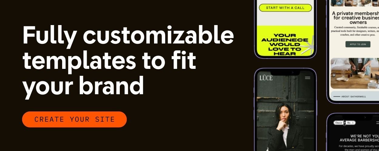
Tip for Showit users: Showit's flexible layouts make it easy to pair your portfolio images with story-driven copy, so you never have to choose between a beautiful site and a personal one. Use that design freedom on purpose.
Website Mistake #2: You Are Hiding Your Pricing (and It's backfiring)
The reason most creative entrepreneurs don't have a pricing page isn't strategy. It's fear.
Sorry if this sounds harsh, but this is important to call out). Fear that you'll be compared to someone cheaper. Fear that a number will scare someone off before they even get to know you. Fear that you'll price yourself out of inquiries.
So the pricing gets buried in a PDF. Or hidden behind a contact form. Or replaced with the word “investment” and a button that says “let's connect.”
Here's what that actually costs you: qualified clients who would book you at your price, but leave because they can't find the information they need to make a decision. They're not afraid of your price. They're frustrated by the friction.
You don't need to list every package down to the penny. But giving visitors a starting point, even a simple “Weddings starting at $3,500“, does two things immediately/ One, it filters out the wrong fits before they fill out your contact form, and two, it builds trust with the right ones by showing you're transparent.
Hiding your pricing doesn't prevent sticker shock. It just delays it and wastes both of your time.
And, you can check out this article on making more money as a creative business owner and the importance of laying out clear pricing.

Website Mistake #3: Your Site is Beautiful But Has No Clear Path
This is the most invisible mistake on this list, because everything looks right.
The colors and fonts all look good. But the navigation has five thoughtful categories, and yet, visitors still bounce without doing anything.
What's missing is conversion architecture, a deliberate, intentional journey that moves someone from “I just landed here” to “I need to contact this person.”
Creatives are visually fluent, which is genuinely a gift when it comes to building a stunning website. But that same fluency can become a liability when it leads to optimizing how a page looks before how it functions. A homepage that's a visual experience isn't the same as a homepage that makes someone want to take action.
The fix: every page needs one primary next step. One, not five calls-to-action, not a menu with seven options, one clear, obvious place to go. Map your visitor journey the way you'd walk a new client through your studio: Homepage → About or Portfolio → Contact. Make that path impossible to miss.
A quick gut check: count the number of calls-to-action on your homepage. If you're above three, that's your problem. Five CTAs is functionally the same as none, when everything is a priority, nothing is.
If someone can't figure out what to do on your site within ten seconds, they won't stay to figure it out.
Want a website that is both beautiful and strategic? Showit gives you the flexibility to design a site that guides visitors toward inquiry, not just admiration.
Website Mistake #4: Your Testimonials Are Compliments, Not Social Proof
- “She was so amazing to work with!”
- “I had the best experience — 10/10, would recommend.”
These are lovely. They are also doing almost nothing for your business.
Vague testimonials tell a potential client that someone liked you. Specific, outcome-driven testimonials tell them what it will feel like to be your client, and why it was worth it.
There's a big difference between “She was so fun!“ and “I cried when I saw the photos. For the first time in years, I actually liked pictures of myself.“ One is a compliment. The other is social proof.
The reason most creatives have the vague kind? They feel awkward asking for anything more specific. But you need to realize that your clients DO want to help you. They just don't know how. So guide them.
When you follow up after a project, ask specific questions instead of “Would you leave a review?”:
- “What were you worried about or unsure of before we worked together?”
- “What's different now that you have [the photos / the website / the brand]?”
- “What would you tell a friend who was thinking about booking with me?”
Those answers are your testimonials. And when you place them strategically (near your CTAs, not just on a tucked-away reviews page), they become one of the highest-converting elements on your site.
Website Mistake #5: You're Writing for Vibes, Not for Search
This one is specific to creative entrepreneurs, and it's worth talking about directly.
You've been told to develop a brand voice, to be distinct and to sound like yourself. All of that is true and good, but somewhere along the way, it led to websites full of language like this:
“Moody. Intimate. Light-soaked moments that last a lifetime.”
Beautiful. Evocative. Completely invisible to Google.
Here's the hard truth: search engines don't read mood. They read intent. When someone searches for a photographer, they type things like “Austin wedding photographer” or “newborn photographer in Seattle.” They are not searching for “timeless, film-inspired imagery for the free-spirited soul.”
The fix isn't abandoning your brand voice. It's leading with clarity before you layer in personality.
Start with the searchable basics, your location, your service, your ideal client type and then let your voice shine. “Austin wedding photographer for couples who want joyful, light-filled photos” does both. It tells Google who you are and it tells your dream client why you're different.
Here's a quick comparison:
| Instead of this… | Try this… |
| “Curating light-filled moments for the wild at heart” | “Portland family photographer capturing real, everyday life” |
| “Timeless imagery for the modern romantic” | “Chicago wedding photographer — editorial, intimate, film-inspired” |
| “Where love meets art” | “Sedona elopement photographer for adventurous couples” |
Lead with location + service + client type. Then let the rest of your copy be as poetic as you want.
Quick Wins: Your Website Mistakes Checklist
Before you close this tab, run through these five questions:
- Does your homepage or About page tell a visitor who you are as a person — not just what you do?
- Is your pricing (or at least a starting point) findable without having to fill out a form?
- Does every page have one clear next step — a button, a link, a direction?
- Do your testimonials mention an outcome, a transformation, or a specific result — or are they just compliments?
- Does your homepage copy include your location and the service you offer — in plain, searchable language?
If you answered “no” to any of these, you've found your starting point.
Your Website Should Work Harder Than You Do
Here's the thread running through all five of these mistakes: they come from the same fear. The fear of being too direct. Too visible. Too sales-y.
But your website isn't a gallery opening. It's the first conversation you have with every potential client, often before they ever send a single email. And that conversation should make them feel seen, informed, and ready to reach out.
You built something beautiful. Now let's make sure it's doing its job.
Ready to build a website that's as strategic as it is stunning? Showit gives creative entrepreneurs the design freedom to create a site that has it all. Gorgeous, functional, personal and professional, and built to convert! Start your FREE trial today.
Or browse templates designed specifically for photographers and creative entrepreneurs.

Sarah has been part of the Showit team for nearly four years, where she works as a copywriter crafting content that educates, encourages, and celebrates the creative entrepreneurs who make up the Showit community. When she's not writing, you'll find her with a book in hand (usually something about leadership or personal growth), cheering on Arizona sports teams, or connecting with people over a really good cup of coffee because, let's be honest, there's always a cup nearby. Sarah believes in the power of stories, the importance of showing up authentically, and that every entrepreneur deserves to be celebrated for the brave work they're doing.