Load Newsreader Bold Font
This is your brain on design. But seriously…do you ever feel like the left side of that graphic up there is representative of you when you try to sit down and design something for yourself? Or do you never even make it to the right side and give up? In a world where amazing inspiration is everywhere (hello, Pinterest), it can be hard to hone in on where exactly you want to chart your design course.
The goal every time I design something is to start out broad and get narrower and narrower until I reach the goal: a winning design. Starting out broad is good, but you don't want to start out TOO broad because that can lead your search into areas that will just make it more difficult to refine. Remember that out goal is to try to simplify things, not to spend too long sifting through irrelevant information.
Before you start poking around the internet at what other people are doing, take a long hard look at what you are doing. What are your goals for the project you are trying to design, whether it be your website, your logo, or something else. If you start by defining your own goals and not looking to others, you can begin to break out of the design haze and get a clearer vision.
It is important to set clear goals before you jump into the abyss that is online (p)inspiration.
Here are some examples of questions you may want to answer before you even begin:
1. What am I trying to design?
2. What is the main function for the design?
3. Who am I targeting?
4. What do I want the design to convey about myself or my business?
5. What design elements do I like specifically?
6. Will I like these elements in a year? Two years?
Once you have set some goals for your project, start to write down terms that you can search for to gain inspiration. If you have more specific search criteria, you will get more narrow results than searching something broad like “website design” or “photography logo,” which will yield a ton of results that aren't really in tune with your goals, or your ideas, and could lead to something that is less focused, or even worse, something that is unoriginal and not at all “you.”
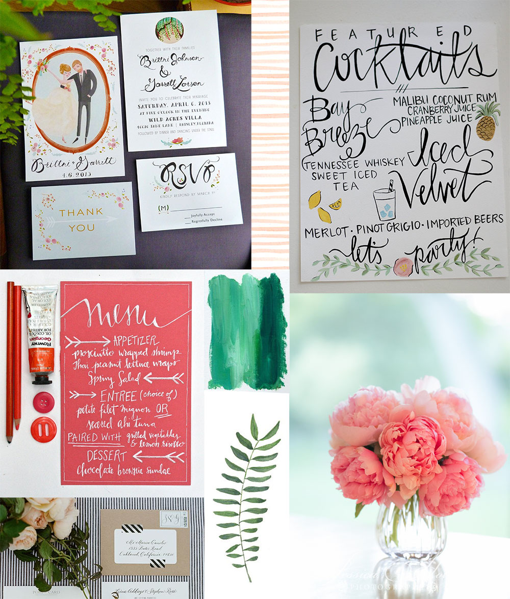
Next, gather ideas that you like together in picture form, and look at the inspiration items as a whole. Do they feel cohesive? Is there anything that stands out as not fitting in? Does it seem like too much going on? Maybe you love wood texture, glitter, polka dots, tape, old paper, stripes…but together they are too overwhelming. Pull images from lots of sources, even print them out and look at them on a board. At this point, eliminate anything that doesn't feel like it is in tune with your overall goals for the design. Do they feel like you?
As you begin to gather things like fonts you like, colors you like, design styles you like, the haze will begin to drift away and you'll be able to reach your goals more easily and more clearly. Even if you use these steps to help yourself think more clearly and then send your project to a designer, knowing that you have first met your goals and are on the right track can give you peace of mind and help your design project meet a successful end.
Rachael Earl is the owner and lead website designer at Earl & Layne, and is a Showit Design Partner. She has been using Showit to design websites and online identities for creative professionals since 2009, and is also a professional photographer. Rachael has been married to her amazing husband since 2000, and they have 4 incredibly adorable offspring together. They call Gilbert, Arizona their home, which is affectionately and alternatively known as "the surface of the sun."


