Load Newsreader Bold Font
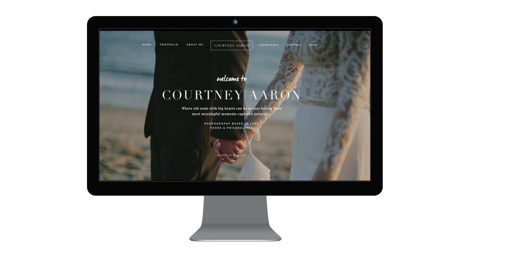
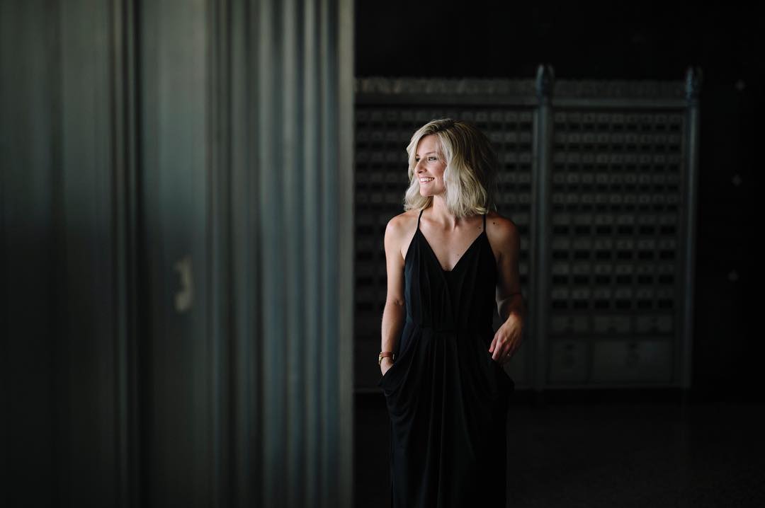
With a thin matte-black frame encircling the first full-sized image on CourtneyAaron.com, your attention is immediately captured. The company name and initial information are set in a classic font, which further exaggerates the unexpected intensity of Courtney's site, a design from Tonic Site Shop called Amaretto Sour. It's the cheerfully scripted “welcome to” that lets potential clients know they are in for a real treat as they keep scrolling. This is exactly how to turn wedding website visitors into clients.
Perhaps the visitor has stumbled upon her site after a Google search for a Lake Tahoe Photographer. Maybe they came by way of an Instagram link. No matter the reason, they will have a feast for their eyes, and a photographer for their upcoming nuptials, as Courtney wows them at every turn.
Give Visitors Your Best Photographer Foot Forward
If you are saving that special image you are so proud of – just don't. Do NOT save your best images for a later scroll. This is your chance. Put your best photo foot forward. Wow them from the beginning with your favorite shot. The one that you want all your shots to look like. Take a page from CourtneyAaron.com. Her first image on her website, the one framed with just the right amount of black matte around it, is a stunner. And every one thereafter is no different.
Write in Your True Voice
Wanna know why potential clients warm up to Courtney immediately?
Sure, you can see her 12 years of experience in every shot. And yes, the layout of her site is on point. But they love her immediately because she doesn't shy away from using her true voice. She has welcomed in visitors to her site with a candid smile and sincere greeting by letting you in on a secret…
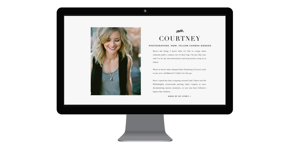
“Here's the thing: I know what it's like to cringe when someone pulls a camera out of their bag. I'm just like you, and I've let my own hesitations and insecurities creep in at times!
Want to know what changed that? Realizing I'd never exist in my son's childhood (photos) if I didn't let that go. Now I spend my days traipsing around Lake Tahoe and the Philadelphia countryside putting other couples at ease, documenting unseen moments, so you can leave behind a legacy that endures.”
Turn Visitors into Clients by Giving Your Website Movement
Many visitors hit a photographer's website to get an idea of who they are from their “About” page. But some want to know more about their wedding photographer's style and will head straight to take a dreamy trip through their portfolio. For those that like to scroll and see where it takes them, you have (on average) 5 seconds to impress them. For Courtney, this is no problem at all. Within a second or two of scrolling, the website visitor is getting completely lost in the fully engaging site. On every canvas, there are several avenues to jump down to learn more about Courtney and her work. Even with the average scroll through, each visitor will not miss the finale of film hidden at the end where the full picture of the Courtney Aaron Photography experience lays.
Perhaps you have been wanting to do a behind scenes video, great idea! Do it as soon as possible to bring in those potential clients. If you prefer still images, it's still possible to add movement with Showit. Check it out over on our help section.
No matter your preference, make your website do it's job for you by displaying your work and your personality. This is your elevator pitch! And thanks to the magic of the internet, you get to pull out all the stops at the same time!
- Don't hold back. Put the best images you have, front and center.
- Use your own verbiage and create a compelling “about” page to help your visitors relate to you.
- Add movement to your website with a shift in text, some parallax, or an amazing video to engage your visitors.
If you want to ask the photographer herself, how she created her beautiful images, or more about her site, connect with her! You can chat with Courtney through her website, of course! She is also on Instagram and Facebook. And if you also split your time between Pennsylvania and Lake Tahoe, you should definitely grab a coffee together!
Courtney Aaron was featured in out 2017 Design Anthology. If you would like to submit your website for consideration, you can do so here: Showit.co/Spark
Casandra is a born and bred East Coaster who finds herself braving the heat of the Valley of the Sun with her husband and three cute kids all for the love of Showit.
