Load Newsreader Bold Font
It's not a trick. There are only two questions you need to answer in order to have a successful business. After speaking with nearly 100 different successful creative business owners, Davey Jones has found the two questions you need to ask to book more clients. Yes, friends! Only two questions to win business! And you want to hear some great news? You already know the answers to these questions!
But do you know what those two questions are? And the real key is to get those two answers out there for potential clients to see. But how? And where? The best place to answer these two questions for your clients, is your website!
There are two questions that stand between you and booking more clients.
Davey Jones, Brands That Book
Are You Good at What You Do?
The first earth shattering question that you need to be able to answer is: Are you good at what you do? That's it. (Your answer better be yes, by the way! ) So, you're good at what you do. You know it. Your mom knows it. Your best friend knows it. But do the people with the money know it? Aka the people who want to hire you!
Can You Do That for Someone Like Me?
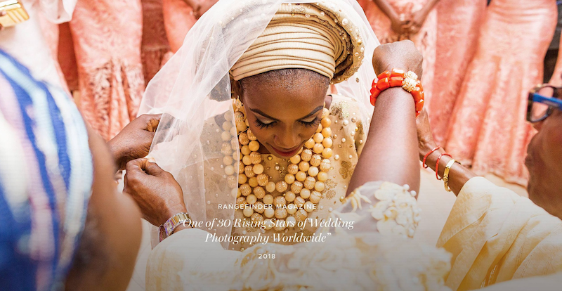
Davey goes on to explain, “it's the second half of that question that usually results in business booked or business lost.” People have seen your images, and they like them. And they want to know if “you can do something like that, for someone like me.” They want to know this when they ask you questions like ‘have you shot at this particular venue'. It seems like a weird question, but that's the heart behind the question. So, you need to answer these questions for your prospective clients, on your website.
Home Page
Most websites aren't split up by pages anymore. The homepage, often referred to what is above the fold (the first thing people see on your website), serves as the most important indication as to whether someone will stay on your site or leave. And guess what? You have, on average, 8 seconds to grab your ideal client's attention.
“The homepage teaches us the importance of clarity in answering these questions,” Jones shares. When a website is designed, it isn't for your family, or your best client, it's for the new visitor – someone who has never heard of you, or seen your work. With that in mind, there are certain elements that help you answer these two questions in 8 seconds to win your new visitor's business.
Put Your Best Image Forward
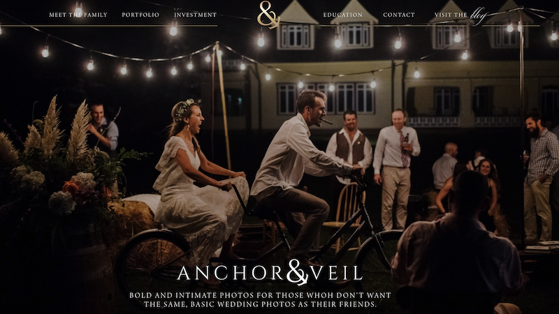
This seems so obvious, but we know there are some ‘savers' out there. Maybe you are thinking you will save your best image for last. Or you will get them to click on something, and then show them your best stuff. Or perhaps you think a bunch of images of you is more important than showing your work. If you proceed with any of those options, you will be missing out on new clients indefinitely, because you will not be answering “Are you good at what you do?”
The obvious choice of putting your best image above the fold as the first thing each new visitor sees is the best option. By putting your best work first, it gives the potential client reason to ask, “Can you do that for someone like me?” Never underestimate the value of visual proof. It can answer both questions without any words.
Location, Location, Location
While you need to take the opportunity to use the perfect image to kick-start their interest, you can remind your potential client that they have come to the right place, with the right words.
Location is one way to reassure visitors they have come to the right place. Davey reminds us there are two ways to do this. You can share your location through your brand positioning statement, or in addition to it.
James and Jess are photographers who take incredible images all over the world! But they are based out of Santa Barbara and New York City. This helps people to get an instant feel for who James and Jess are, and where they are located.
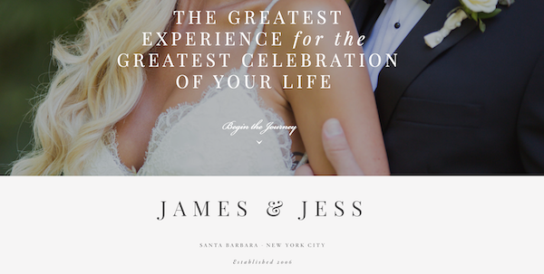
Make sure that your clients know where they can find you, and make it very, very clear. Creative can be cute, and clever. But it can be confusing. And confusing doesn't book clients. People say they want creativity, but they book clarity!
People say they want creativity, but they book clarity.
Davey Jones
About Pages
According to Mr. Jones, the About Page is one of the most misunderstood pages of a person's website. Some might feel it's a chance to talk about themselves. However, the best use of the About Page is to use it as an “opportunity to show people that you're capable of getting results for them.”
Eventually, your clients will be interested in who you are as person, and will want to know more about your “why” and your creative process. But, “in the beginning, they really only care about us in so far as we can help them to get to where they are going.” As Donald Miller of Storybrand says, “THE CUSTOMER IS THE HERO, NOT YOUR BRAND. When we position our customer as the hero and ourselves as the guide, we will be recognized as a trusted resource to help them overcome their challenges.”
Empathy is Key
Wondering how to show people you are the best choice as their guide? Jones shares the key to convincing your visitors you are the best person to serve them is through empathy. “Show them that you understand their problem,” he goes on to say. By demonstrating you understand the issues that lay ahead, helping the clients to know that you “understand the joys, anxiety, and challenges they might be facing.” And furthermore, giving them insight to the fact they have a problem!
Terri Baskin does this perfectly on her About Page, on Terribaskin.com . She is the guide who will give her clients her full attention on their wedding day – AND beforehand. It's hard to plan a wedding! Terri gets that. And she lets her clients know that she is here to help them. Because they are the hero. Not her.
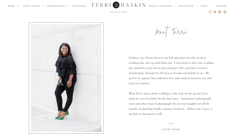
The About Page is a great place to put into words what your target client feels or believes.
Davey Jones
The most important thing to remember? The about page is not about you. Even if you aren't a brilliant writer, you can convey empathy in simple terms. As copywriter Jess Jordana says, “Does what you're including on a page help people imagine you doing what you claim you can do?” So ask yourself, does it matter that you love plants and want to travel the globe? If it helps to connect with clients, and show them that you are the right person to guide them to the experience they are looking for – then add it! If it doesn't, then delete it.
Service Page
Most service based businesses will treat service pages as a pricing menu. In actuality, the service page of your website is thinking through the objections a client might have, an addressing those issues. By overcoming these objections, you can answer the question, “Can you do that for someone like me?”
The service page should show-off the transformation you provide your clients.
Davey Jones
First step to having an effective service page is by writing down all the possible questions or concerns your clients have, or may have in the future. Question by question, write down answers as if you were speaking directly to your dream client. Some subjects to use as a jumping off point can be about your approach/philosophy, your process, are there examples of your past work, and then use social proof to answer those two questions.
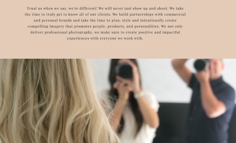
What Sets You Apart
Jon and Erika Hayes of Ericaandjon.com do an amazing job of this on their site. They let their clients know, right off the bat, that they will take charge of the photoshoot. They don't just show up and shoot. They know what it takes to make brand photography stand out, and have a personal feel. Images on service pages give social proof that you are good at what you do, so highlight the best of your work, or of you working!
And to finally and resoundingly prove that you are good at what you do, add social proof that you have been published, and that your work has been featured in other places than your website and your social media feeds. Client testimonials are also very powerful at driving home the point that you have done what you have claimed that you can do, for many people.
Why social proof? “It's one thing for you to say you are good at what you do. It's a whole other thing for someone else to say you are good at what you do.”
– Davey Jones
Contact Page
The place on your website where the most conversion happens is on the contact page. Jones believes this is the most important part of any website. He believes this is “where the magic happens.” Davey says, “The contact page is a place where you want to emphasize even in the small things, that you are good at what you do, and that you can do that for someone like them.”
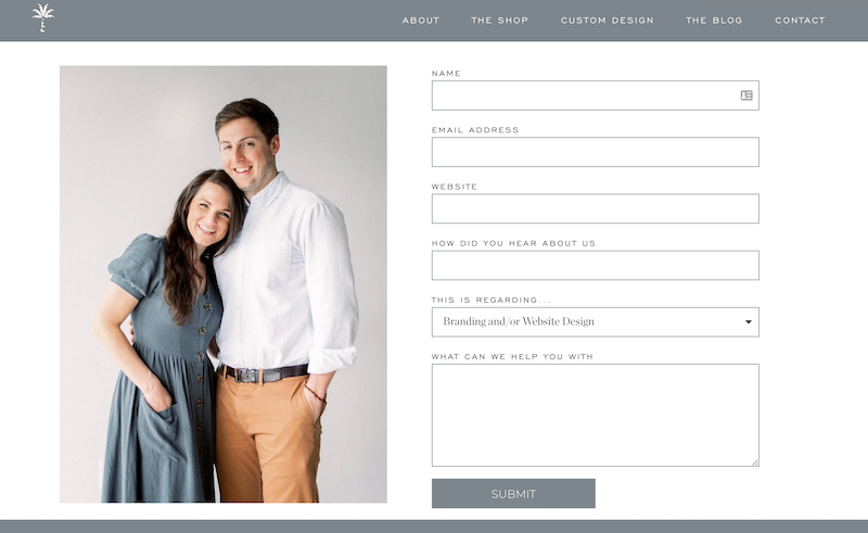
A good contact page should not have needless questions. A great contact page should only have questions that you will actually need an answer to. And as far as information that you are providing, again, less is more. Include an email address where they can contact you. Set expectations of when someone might receive a response from you. Include an image of yourself or your best work. For good measure, Jones believes it's worth it to add one last client testimonial to “remind people it's worth their time to reach out to you.” Every part of your website, even on the contact page, prioritize answering the two questions you need to win business.
Final Steps
Now that you have combed through every page of your website, do you feel you have answered the two questions? Did you think about how a potential client might wonder if you are good at what you do? When you provide them with images and testimonials throughout your site, did you think of their next question – “Can you do that for someone like me?” To win business you must answer these questions. And then you have to anticipate their objections. Give them enough proof so when they ask, “Even me? Can you get those results for someone, even like me?” you have the answer ready!
If you don't have a website, and you are feeling very convicted that you need one, you can start your free 14 day trial right here! Or you can look through our Design Market to find the template that speaks to you to get you pumped up even more. If you are a professional photographer – you need a professional website that books new business.
Thanks so much to Davey Jones for presenting this amazing talk at Showit United. You can contact him at his website, or on social media. Davey and his wife Krista, are amazing designers for Showit, and you know their templates will come fully optimized for all these great tips to show your clients that you are good at what you do!
Casandra is a born and bred East Coaster who finds herself braving the heat of the Valley of the Sun with her husband and three cute kids all for the love of Showit.

