Load Newsreader Bold Font
As a photographer, the way you display your work can be the deciding factor whether you get booked or not. Depending on the type of photographer you are, and your unique perspective on your client experience, certain styles of galleries will work better for your photos than others. Showit offers 3 different types of galleries: tiled, simple, and sliding. The design possibilities are abundant on how you can make these look on your site.
There are 4 design layouts that each benefit a different type of photographer. Let's cover the benefits and drawbacks to each so that you can make the best decision for you and your work.
Sliding Gallery
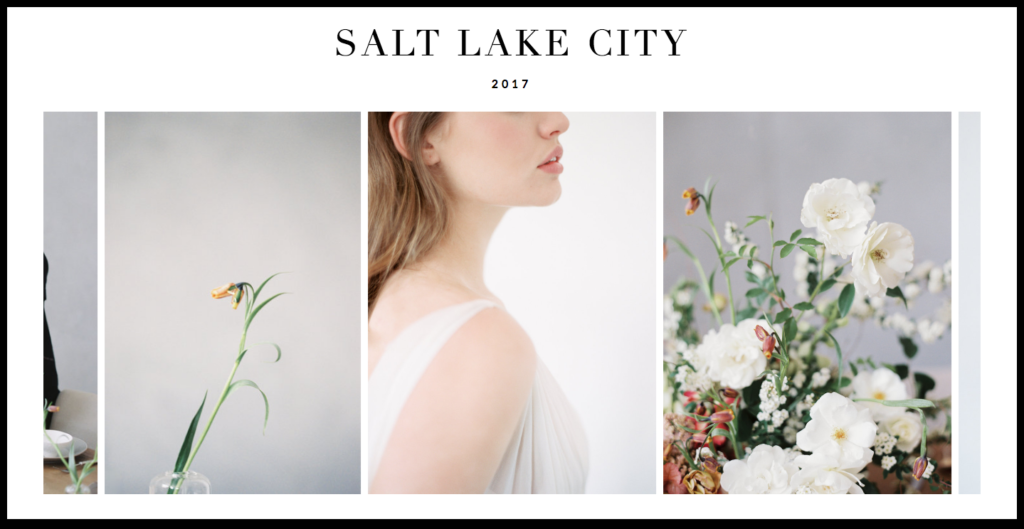
photos by D'Arcy Benincosa
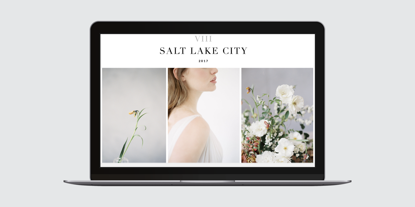
Sliding galleries are probably the most popular style of gallery you will see on a photographer's website. It's versatile and a great way to feature individual photos while still keeping a connection between the whole collection. The sliding style, when it comes to the type of photos, works best with a shoot that needs focus on one image at a time, but clicking through the gallery creates a narrative. You can control the sequence people will view the photos in, and it allows you to bring them on a journey through your work.
The key thing to remember is to curate your photos so that you can tell the same story in as few photos as possible. Not only will it help with loading times, but you don't want a visitor on your site getting tired of clicking or dragging through the photos and stop.
Best for:
- newborn sessions
- weddings
- family sessions
Fullscreen Gallery
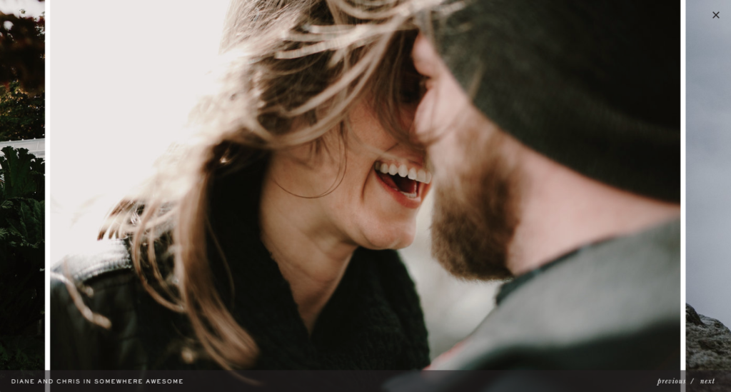
photos by Kristen Marie Parker
A bold (and less utilized choice) is a full screen gallery. You would use a single image (known as a simple gallery in the app) or a sliding gallery for this look by making the gallery canvas height, and stretch your gallery itself to stay the width and height of the visitor's window. The photos being up close and personal is a fantastic tool for photographers who focus on the emotions of their subjects/clients. Being able to immerse the visitor in the photo can sell the feeling of that moment. When photographing especially special moments in someone's life, full screen photos showcase your work best.
As with the sliding gallery, you don't want too many photos because they need to load much larger to stay sharp. Choosing photos that are your favorites can keep the number of photos to a minimum, but make a maximum impact.
Best for:
- maternity sessions
- first 48 photos
- adoption session
- proposal session
- fine art photography
Matted Gallery
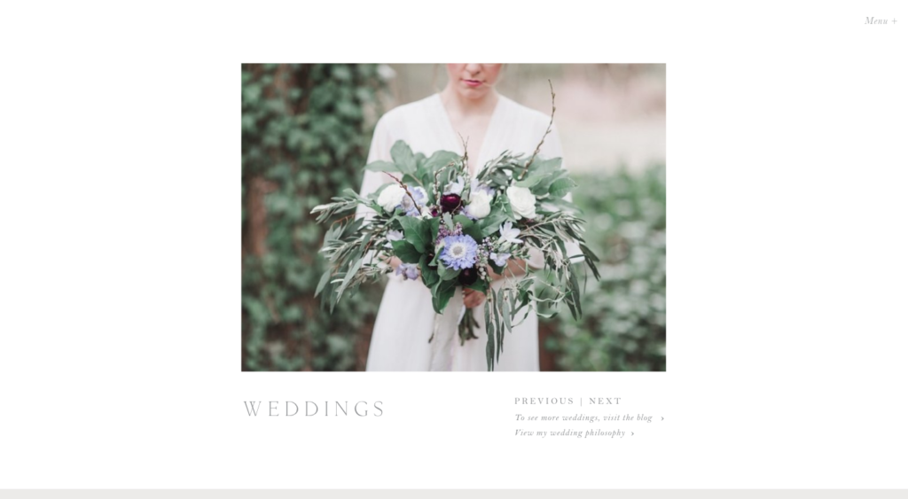
photos by Annamarie Akins
A matted gallery looks exactly as it sounds…the gallery resembles a matted photo in a frame. When you want to put a lot of focus on the details of the shot, or display a certain number of shots that tie into each other through aesthetics or story, keeping the look of your gallery minimal keeps your work at the forefront.
Showing a single image at a time also works well when you're displaying headshots/portraits that may not have been a large photoshoot. The visitor can see the detail and care you had when taking the photo and focus on one look or person at a time.
Best for:
- wedding details
- engagement sessions
- product photography
- stock photography
- portaits
- editorial
- headshots
Tiled Gallery
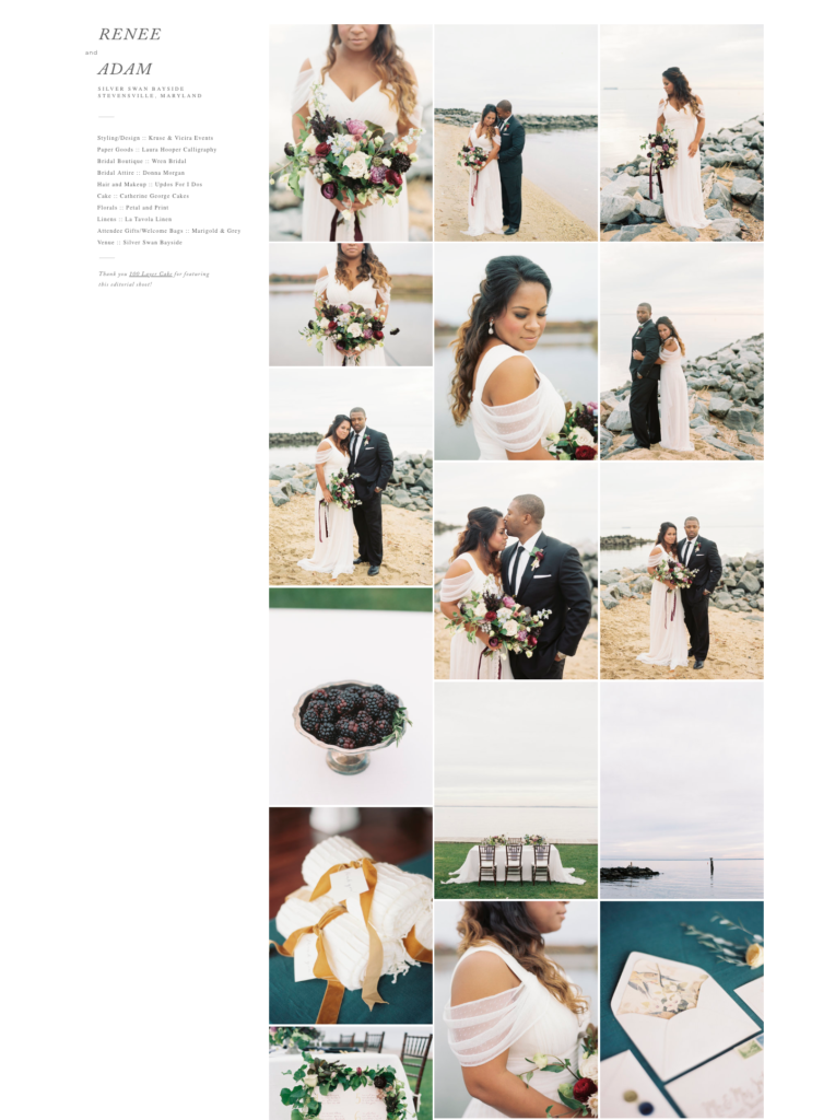
photos by Krista Jones
Tiled galleries look a lot like Pinterest. You can see a lot more images at once (way more than the other options) and this helps to create a mood or atmosphere for your photos. When you're trying to show a big variety of photos, viewing them together gives them context. Photography without people in them also works great in a tiled gallery because you can look at the overview of the shoot rather than click through a lot of pictures that can seem cold viewed one at a time.
For non-photographers, this layout also works well to tell a story. Event planners can show a mixture of the details they created along with the full event's location, decorations, and people enjoying the atmosphere. Tiled galleries can require a bit of scrolling but being able to take in more information at a time keeps the visitor engaged while they view the full range of photos.
Best for:
- brand photography
- weddings (for event planners and florists too!)
- interior design photography
Learn more about Stefani at the Stefani Jessica blog.
