Load Newsreader Bold Font
In the world of fashion, old trends can make a comeback. Look at mom jeans – who could've predicted they'd ever be popular again? But here we are. When it comes to trends in website design, however, we have yet to see where designs and trends of years past have made a significant comeback.
Whether you’re working with a client who needs their first website designed or you’re helping them on a redesign to keep up with the changing times, there are a few trends that are undeniably going to dominate in 2024. Some of them are for purely aesthetic reasons (you have to give people what they want in the here and now, right?). Others serve a practical purpose, ensuring that the website is able to meet the demands based on how people use the internet today.
Let’s take a look at five of our favorite trends in website design you’re going to see in 2024.
1. Design For Mobile-First

This one has been inevitably building for a while now, but 2024 is finally the year that mobile designs are taking priority.
Don’t get us wrong — desktop-friendly web designs are still important. You'll for sure want to keep them in mind for anyone who visits your website. But according to AllConnect, more than half of web traffic is happening on smartphones. Specifically, it’s about 60%, compared with just 39% happening on computers.
So, when designing your website, prioritize mobile screens. Unlike computer screens, which are wider and shorter, phone screens are longer and narrower.
Mobile-first web designs should also be far less cluttered. Simple, clean designs show up better on those small screens. You’ll also want to consider your website speed when you’re designing it to load on a person’s phone, where it will sometimes be relying on cellular data rather than an internet connection.
Although mobile screens are smaller, that doesn’t mean elements should be scaled down. Instead, consider making them bigger. Large fonts will be easier to read on mobile phone screens, and larger buttons are easier to hit with your thumb.
While some website platforms offer responsive design, where layouts automatically adjust for mobile screens, Showit provides the flexibility to design a distinct mobile version. This will ensure your website will look exactly the way you want it.
2. Redesigning Celebrities’ Websites for Fun
If you’ve been following your fellow graphic designers on TikTok or Instagram lately, you might have noticed a trend. Website designers have been customizing their templates to fit popular brands. (If you’ve missed this, we highly recommend checking out this video where Tonic redesigns a website for the Barbie movie. Or, this one where Davey & Krista take on the Starbucks pumpkin spice latte.)
So, why are web designers doing this? Well, for starters, it’s a creative way for them to show you what’s really possible with the templates they offer in their shops. But also, it’s just a fun way to practice their branding skills. These designers are challenging themselves to look at what makes an iconic brand so recognizable and then incorporate those branded elements into a template they already have available.
In the Tonic video, you see how a neutral and minimal template, like Negroni, gets the right pink-dominated color palette and sophisticated lettering to capture the world of Mattel’s signature blond doll. In the Davey & Krista video, the Amelia Island template uses autumnal colors and imagery to create those cozy vibes you get when you’re sipping a PSL.
What’s a brand that you recognize instantly? Once you’ve built customizable templates for your shop, go ahead and show your audience how you can adapt that template for a very specific brand. We think you, and your audience will learn a lot in the process.
3. Vibrant Color Gradients

We’re leaving boring behind in 2023. (Let’s be honest though — boring was already on its way out!) Instead, 2024 is the year of vibrancy. This is something we expect to see a lot in color gradients, which are becoming all the rage among website designs.
So what are color gradients? These are where you see an element on your website blend two colors across a spectrum. This could be your background, a button, or even a headline. The element may start out red on the left side but blend into blue on the right side. Or, it starts out as purple in the middle and blends outward into yellow.
These gradients are a fun way to add lots of colors and make flat surfaces on your page stand out. As you’ve probably observed from experience, anything that stands out is good for engagement!
Which colors should you use for your gradients? Sure, you could do monochrome or neutral gradients, but bright colors make a bigger impact. We recommend using brand colors that provide contrast and using gradients in only one place at a time. If you have a landing page with more than one gradient element, it’ll get too cluttered.
Want to see how easy it is to create gradients with the Showit platform? Be sure to check out this article for details.
4. AI Trends in Website Design

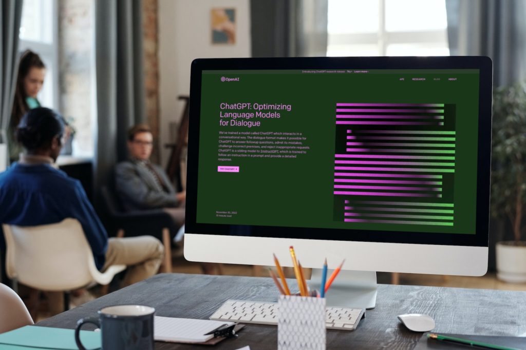
AI was practically the word of 2023 in tech, and we can expect to see that continue in 2024. More web designers are taking advantage of all that artificial intelligence has to offer, so they can simplify their process and build websites that serve brands better.
For example, AI chatbots are now powerful enough that they can solve many customer service problems, so you may consider installing one on the Contact page of the websites you build. This means your client’s website is able to provide help 24/7, even when a person isn’t able to respond to queries. That’s always great for a brand’s reputation! Plus, in 2024, many consumers have come to expect that help will always be available when they need it, and they don’t want to wait until the next business day to get assistance.
You can also use generative AI to develop website copy or imagery, though it’s important to note you’ll still want a pair of professionally trained human eyes to look over any of this generated content before you use it. AI copy can be stilted and impersonal, and AI graphics often have parts of them that are sloppy or incomplete. Use these as a starting point that human talent can then clean up and tailor to your specific branding needs.
Some creative professionals might have reservations against using AI, but we expect 2024 will be the year that people start to recognize it’s a tool, nothing more. Just as a calculator can’t replace a mathematician, we don’t think generative AI can replace creative talent. But it can certainly assist you in your process if you know how to use it!
5. Big, Bold Typography

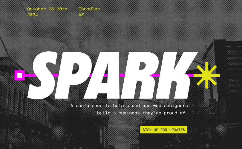
Remember when we said boring was out in 2023? That doesn’t just apply to color. We expect big, bold typography will be popular throughout 2024. Think about it — when you pull up a website and the first thing you see is large text, it’s going to not only grab your attention but also leave an impression. Take advantage of large, bold typography to convey a simple message with as few words as possible.
Note that we said as few words as possible. When you’re working with big, bold text, you want to keep it straightforward. If you need more than a few words (say, four or five), that’s a message better served with smaller text. Large text needs to be succinct.
Because this typography is big and bold, you need to remember not to overcomplicate it in other ways. Choose fonts that are easy to read at that size (something without serifs), and don’t mix it with too much other imagery — in this case, the words themselves are the starring image. Mixing them with other graphics could get overcrowded.
Need help picking out the font you’re going to splay big and bold across the top of your page? We’re happy to tell you Showit lets you use all of Google’s free fonts or upload your own customer fonts to use in your designs. Check out this article to learn how.
Which of These Trends in Website Design Will You Embrace in 2024?
What do you think? Do you agree with our predictions, or do you have others of your own?
Remember that these 2024 web design trends are just guidelines — they’re not hard-and-fast rules that anyone has to live by. Instead, you can adapt them to fit your own creative vision, especially when you’re using Showit to have full creative control over the websites you design. That’s why so many web designers prefer to use Showit — because of all its capabilities.
Plus, you get a free trial for 14 days. So why not start exploring all the tools and resources you could have at your disposal? This is your chance to start seeing how you can make all of these 2024 trends work for the websites you design!


