Load Newsreader Bold Font
Building and writing for a blog is a huge achievement that takes a lot of time and effort. Many times our focus remains on the primary experience that our visitors have when they land on the blog page, and rightfully so! But what happens when a viewer dives into the posts and starts browsing beyond that homepage? Do they feel compelled to stay and keep browsing?
Keeping a user on your blog requires a combination of aspects all working well together. This includes relevant blog post content, appropriate timed navigation, and creating a feeling of discovery as they navigate through. An easy way to help create a curated experience of your posts is to direct users to a specific category of posts. Guiding them to a group of posts that peak their interest is a good way to keep them browsing longer. We’ve got 5 steps you can take to create a curated blog experience so people spend more time on your site and hopefully also a higher chance of becoming a customer.
1. Which Categories to Feature?
If you blog under a variety of categories it can be helpful to allow your viewers to jump to a specific category of posts. So which categories should you feature? That answer varies. You might include all categories if it’s a limited list and you post in each category frequently. You could just feature the primary categories that you post frequently in or maybe just the ones that are focused around your primary business goals. Whichever list of categories you decide on will be the perfect starting place and can easily be changed in the future.
2. Adding Category Links to Your Design
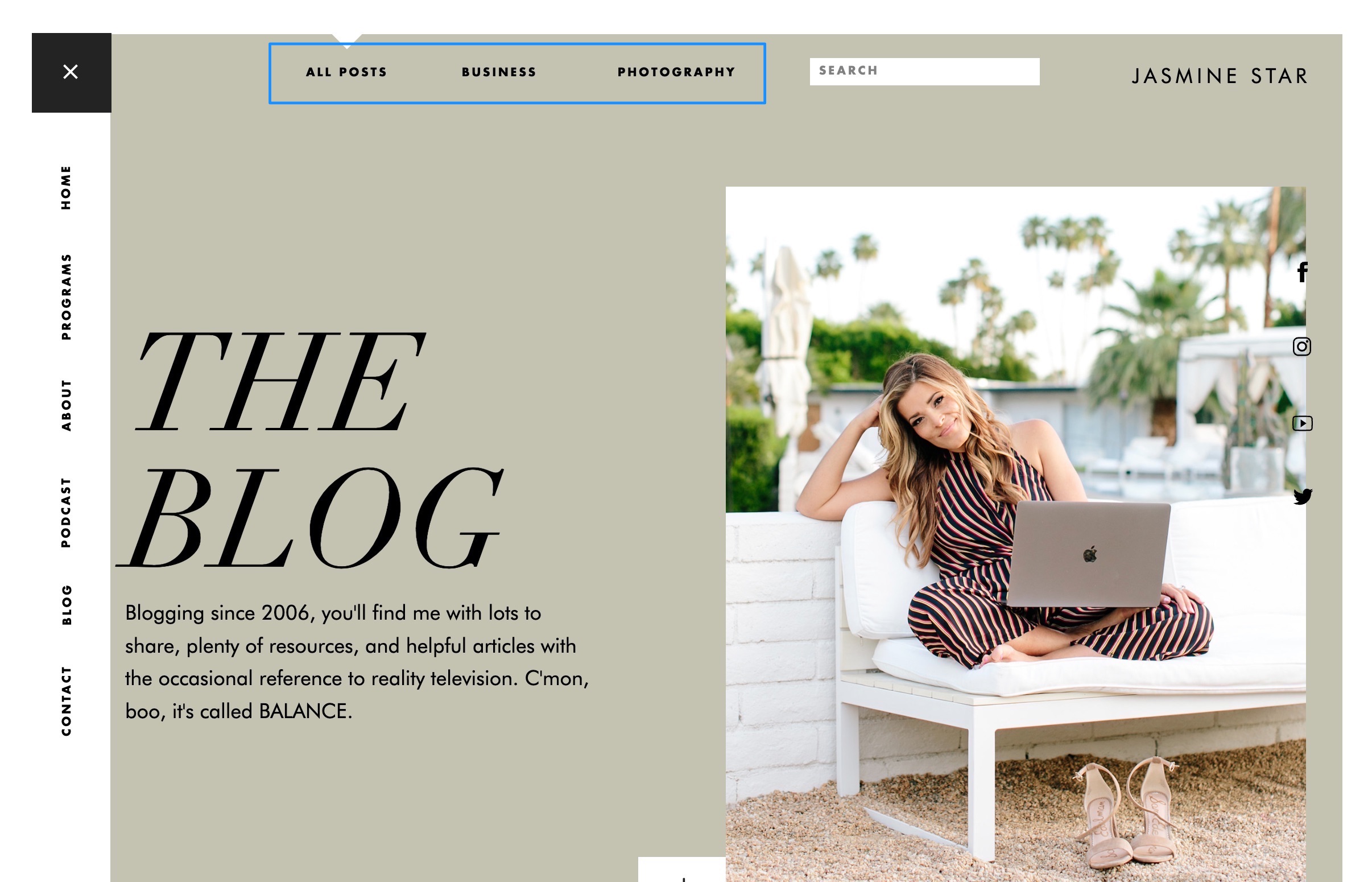
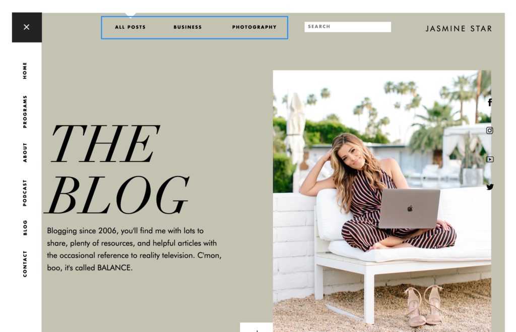
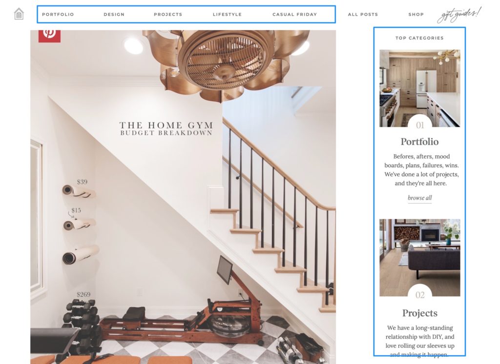
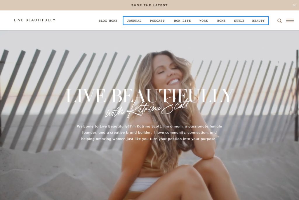
In your design you’ll want to decide where links to your categories will reside. If your website is based around your blog content then you might include them in the primary navigation. If the blog is supplemental to other business pages then you might only include them on your primary blog page. You can include them as text navigation links or create larger clickable area in your design. The simplest and most direct approach is to incorporate them into the header of your primary blog page. That way when someone visits your blog, they can easily jump to a specific category of posts.
Here are some examples of different locations:
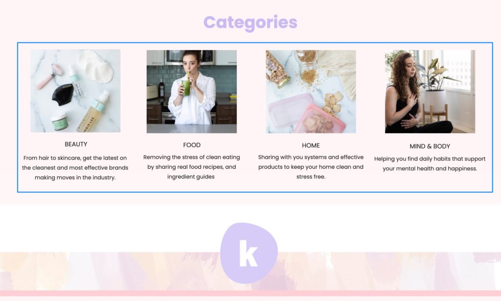
3. Linking to the Categories
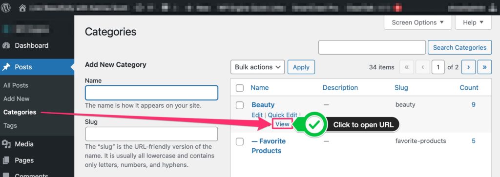
Once you’ve added category links to your page the next step is to make sure you link to the correct URLs. On the Showit platform you will blog via WordPress. To get the correct URL for each category, you’ll need to login to the WordPress admin and go to Posts > Categories section.
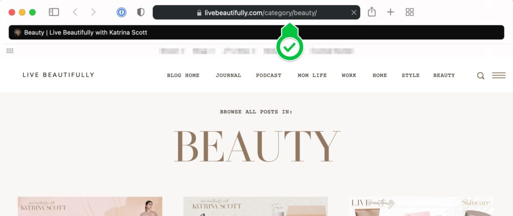
You’ll see the list of current categories. As you mouse over each category you’ll see a “View” link appear. Click on that link to open the URL and copy it into your design for each category link.
4. Checking Your Improved Blog Experience
Now is a perfect time to look at your website analytics to record two values: Average Session Duration and Pages/Session. [In Google Analytics, you’ll find both values under the Audience > Overview report] Write those values down on a sticky note with today’s date. Then check again in 3 months and see if this easy change has improved either of those related values.
I find it’s best to set it and forget it…(with a reminder set)…then come back and see if there are improvements. If you watch it daily or weekly you can easily get lost in the weeds of data instead of letting it play out and see how your averages shift.
5. Keep Improving
Our goal was to keep users spending more time on our site by providing a way for them to find curated content specific to what they want. If you apply these changes you will likely see improvements in your analytics. Regardless, you always want to continue improving on the experience. If you’re not seeing the improvements you expect, consider a couple things:
- Evaluate the categories you’ve chosen to feature. Maybe there are other categories that may prove to be even more relevant.
- It’s possible that the categories you’re featuring are the most relevant, but you don’t have enough content within those categories to browse.
Both of those can easily be resolved by continuing to make improvements.
The goal in the end is that you find that these steps helped improve your visitors’ experience. They can more easily find the resources that you are offering through your blog and you give them the opportunity to guide themselves to the content they want most.

JT is the Product Marketing Lead at Showit and has worked on the platform for over ten years. He partners with the Product and Marketing teams to shape features, guide launches, and advocate for customer needs. Previously, he led Showit’s designer community and brings firsthand creative experience from his background as a professional wedding photographer.
