Load Newsreader Bold Font
There is something to be said about getting your business out there on the Internet. These days, it is a necessity to have some sort of professional web presence, as it almost establishes you as “legitimate” in the business world. When I hear about a new business, I will typically jump on the Internet to learn more about them from their website. You may be wondering, though, how to make the jump from just getting your website out there to having a web presence that has longevity for your business.
As a designer, I always let potential clients know that my goal is to give them longevity in their web presence. When someone is making an investment in a designer, it is important that the investment has a long life expectancy. The same can be said for a website you are building yourself. Even if you are not investing in the traditional sense (think money), you are investing your own time and energy into creating something that will, in many cases, be the first introduction that a potential client has to your business.
A typical website should last you about three or more years unless you make a business change, or there is a big change in technology.
When creating something, or having something created, it's important to go into the project with some clear goals:
Who am I?
It is important when you are looking to establish longevity that you know who you are. Your website is an online portrayal of YOU, especially if you are the face of your business. Does your website showcase your work in a consistent manner? Does it fit who you are and fit your style of work? Potential clients seeking a new website often exclaim to me that their website just doesn't feel like THEM. This can be the result of not thinking through the design beforehand, jumping on board with a fleeting trend, or just wanting to get something out there on the web to feel established as a business. Again, you need to have a web presence, and change isn't necessarily bad, but when you begin to know who you are and have a consistent style, it's time to really make sure that your site screams YOU, and that your clients can go to your site time and time again without feeling that you are having an identity crisis!
Who are my clients?
This is another key aspect to consider when trying to build a website that has staying power. One of the biggest reasons that people feel the need to change their websites is that they are not attracting their ideal client, or not attracting any clients at all! This can definitely be an issue to address, and something that you should think through when designing your website. If your goal is to attract an active, adventurous client, for example, make sure that your site has an adrenaline kick to it! Maybe you want to employ a video intro, or some sort of transitions to convey a sense of motion. One site that I worked on that has this sort of fun motion to it is Bethaney Photography, as seen in the featured post image. Bethaney is a world-class traveler and adventure junkie, and wanted some fun movement to her site to convey just that. Visit Bethaney Photography's live website: http://www.bethaney-photography.com
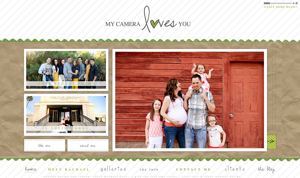
If you want to attract fun clients, make sure that your site has some fun and unique details to it. Along with being a designer, I am also a photographer, and employ the “fun” mentality when trying to attract my own photography clients on my own photography website. Fun colors, quirky design elements and fonts, and unique layouts and information help me to attract the fun type of client that I am seeking. I often get inquiries that comment on the fun factor in the site, with potential clients wanting a fun photo session. I try to show fun, colorful work that is consistent with what my clients will get, and write in a quirky manner, which also identifies with my own quirkiness!
What products do I offer and am I showcasing them correctly?
Many reading this are probably photographers who are trying to attract photography clients, although there are many other businesses also using Showit. No matter what your business is, make sure that you are really displaying your product so that clients instantly know what it is that you do and what you can potentially offer them.
Consistency in how you showcase your product is of equal importance to consistency in your product itself.
Does that mean you should feel stuck with what you have? No! If your style changes, or your brand changes, or your ideal client changes, these are all legitimate reasons to need to change your web presence to meet the new goals of your business. Too often, though, we jump on the latest trend and don't make sure that trend actually suits our unique business and our unique business goals.
With these tips, I'm confident that you can build a website that has longevity for your business, while attracting the clients you are in search of.
How long have you had your current website, and are you in need of a makeover? How is your website serving and not serving your business?
If you would like me to review your site and give you some tips and pointers, be sure to send me an email at rachael@earlandlayne.com and I'd be happy to help steer you in the right direction!

Hi! I'm Jihae Watson! I was born in Seoul, grew up in Toronto, Ontario and now live in Gilbert, Arizona. I love all three cities so very much as I have plenty of family, and favorite restaurants in all three locations.
I am married to a stud named Chris, and we have four fantastic kids. Together we love being a foster family, and we presently have the sweetest little foster babe.


