Load Newsreader Bold Font
By now, we've all heard about “Mobilegeddon” that happened in April, with Google re-ranking sites that were not mobile-friendly. Today, I want to talk about some of the errors that might come up on Google's Mobile Friendly Test and what you can do to avoid them.
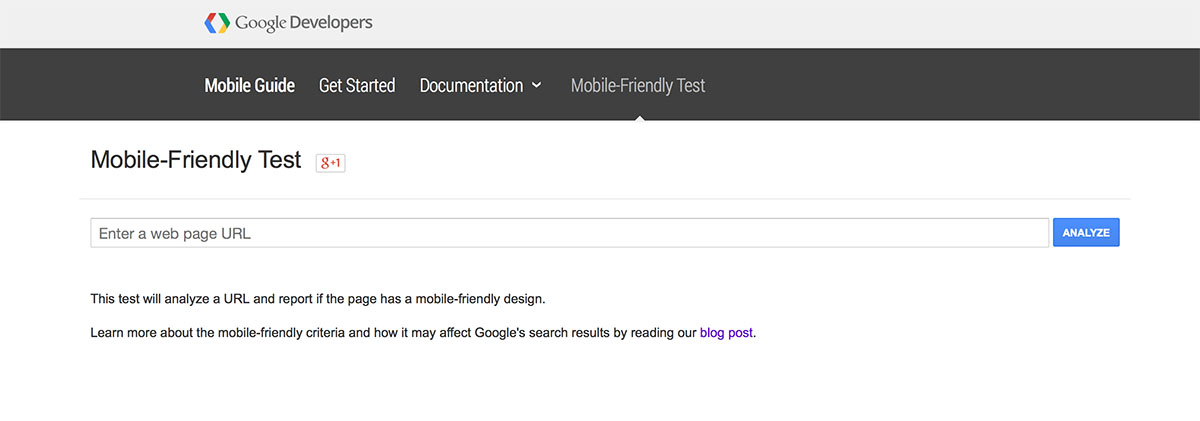
If you haven't run the test, be sure to check your site HERE.
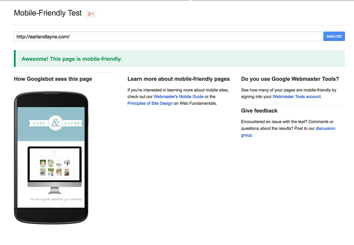
In my experience, the vertical Showit mobile sites have passed with flying colors, but there might be some pitfalls that you experience if you're designing your own site, so if your site didn't pass, making a few changes can easily fix that!
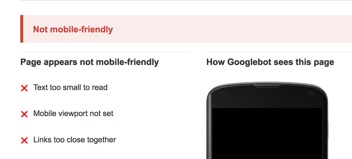
Here are some of the most common codes I've seen pop up:
1. TEXT TOO SMALL TO READ
Google recommends a font size over 16pt be set in order to be deemed “legible.” You'll definitely want to do some playing around though, as different fonts render differently. I recommend scaling your site down to a low percentage using the zoom inside Showit (right about to the size of your phone if you can) and seeing if you can read the text. Ultimately, you want people to be able to read what you wrote anyways! As a baseline though, try choosing a size above 16pt.
2. MOBILE VIEWPORT NOT SET
This one shouldn't be an issue with Showit sites, however, we did have this error come up on a site that had a YouTube video player. If your site has a YouTube video player, consider switching it over to Vimeo instead, which should clear the error. This is happening because of how YouTube renders videos and text size in their videos, so hopefully that will change in the future. For now, try adding the video in a different format and it should clear the error.
3. LINKS TOO CLOSE TOGETHER
This one seems pretty self-explanatory, but sometimes if you have text links on your site, they are going to trigger this code. The easiest way to clear it is to use the mobile menu widget in Showit, which also is an awesome way to make your site streamlined for mobile. Some people aren't a fan of the look of the mobile menu, so if you fall into that category, just try to space your links out a bit.
It can also help to get rid of some of the links on your site. I'm a fan of more streamlined mobile sites anyways since people are usually viewing them on the go and having a bulky mobile site may make them leave sooner if they can't get the info more quickly.
Have you had any issues in getting your site to pass the test?
Rachael Earl is the owner and lead website designer at Earl & Layne, and is a Showit Design Partner. She has been using Showit to design websites and online identities for creative professionals since 2009, and is also a professional photographer. Rachael has been married to her amazing husband since 2000, and they have 4 incredibly adorable offspring together. They call Gilbert, Arizona their home, which is affectionately and alternatively known as "the surface of the sun."


