Load Newsreader Bold Font
Much like any other great blog post, I am going to spare you the fluff. Yeah, you read that correctly. I am going to cut right to the chase and save you all what may seem like hours of scrolling to get to the “meat and potatoes.” Why? Simply because we are all busy bees and in the words of the wise Kimberly “Sweet Brown” Wilkins, “Ain't nobody got time for that.” I digress…
The quick and dirty on who and what I am not: I am not a photographer. I am not a designer. And let's be honest, my three year old makes better “art” at preschool than I ever could. Well, the last statement may not be true but I am trying to paint the picture here for you all. I am not creative.
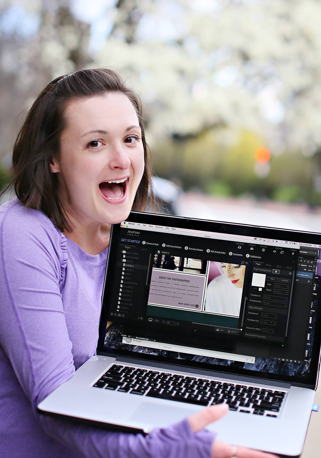
The quick and dirty on who I am: My name is Lauren. I have been with JessFoto for three years. I am the studio manager/marketing director/the one who handles anything and everything that doesn't have to do with Photoshop or a camera. …Remember the great and powerful Wizard of Oz behind the curtain? This kid.
Needless to say, we had been talking about doing a major overhaul of the website and blog for months leading up to our actual makeover. What can I say, decision making is not our strongest forte. I wouldn't go so far to say that we wanted to rebrand, but what we currently had for our site and blog combination didn't match our brand. Hell, they didn't even match each other! We decided in August that we would tackle that daunting project when offseason hit in January.
Well, January flew into February. February turned into March where I first learned of Mobilegeddon (enter panic mode) at WPPI. Then March turned into April. April 17th to be exact. Yes, you read that correctly. 4 days before the mobile conversion. F.O.U.R. DAYS. 2 of those 4 days were the weekend (pre-wedding season family time) and Friday was already halfway over. We finally agreed on a template from GoLiveHQ. Fantastic — now that I have a pretty rad template, I need to stumble my way around Showit without having even opened it before today and build a website? AND a mobile site?!? SUPERB!
As if my limited time frame wasn't stressful enough, let's throw some major hurdles into the mix.
- After the GoDaddy commercial scandal during the Superbowl with the puppy mill, we switched to Namecheap. Yes, we are major dog lovers. HOWEVER — the nameservers never got switched over during this process. I took it upon myself (first mistake right there) to switch them over (on April 22) to then only create a catastrophe…
- The fonts that were purchased with the template hadn't been properly uploaded so the edits we were making weren't showing up when we tried previewing the site online.
- Have you ever heard that saying, “too many cooks in the kitchen spoil the broth?” I swear that quote was created for us. We had our servers and hosting and anything that was of importance to complete the migration of both sites with different providers. Yeah. It took myself and JT (but mostly JT) a solid 30 minutes just to figure out where our blog was being hosted.
- Sleep deprivation. Enough said.
- The website and blog were down for one week beginning the day AFTER Mobilegeddon. Shameful. I know. Consequently, our Google ranking drops from page 3 to page 9.
- Instead of just duplicating my desktop site to a mobile version, I literally created a brand new site. From scratch. No template this time.
Recap of Dates in case you got distracted by a shiny object and weren't following along:
April 17 — purchase blog and website templates
April 19 — blog template was uploaded and tweaked
April 20 – After signing up with Showit back in March, we were finally registered (Best day ever)
April 20 (later that same day) — We realize for the first time that our nameservers for the website never transferred over (Worst day ever)
April 21 — Mobilegeddon strikes
April 22 — We couldn't locate the FTP Server/Host, FTP User, and FTP Pass info for the blog (because who knew we had a SECOND GoDaddy account)…
April 24 — We caught wind that the reason the blog is down is because of my expertise. Obviously then, the domain hasn't been set up yet since our blog and site were all going to be on one domain.
April 27 — We kick off our week long launch campaign on FB not knowing if we would even have a website to launch.
April 29 — The game changer. My one-on-one call with JT. Let me just pause to say JT is a unicorn. A legit freaking unicorn. He made magic happen and we got everything finally squared away.
April 22 to April 29 — our blog AND website were down due to my own handy work all the while thinking it was just normal procedure in getting everything switched over. Subsequently, our ranking on Google dropped to page 9. It was a sad, sad time in my life after having thrown myself into learning all I could about SEO over the course of the last 6 months. I mean, I was literally dreaming about SEO in my sleep.
May 3 — Website went live. Lauren celebrates by finally sleeping.
May 7 — The blog was migrated over to Showit's WordPress hosting after having to restart the process due to issues.
May 20 — The blog conversion from jessfotoblog.com to jessfoto.com/blog is complete.
June 6 — We made it to the first page of Google search after a tireless month of plugging away at our SEO (the highest we had ranked previously was page 3).
John, Christian, and JT are literally angels that fell from the Showit heavens right when I needed them. Without you guys, I would still have a website and blog that were down because I thought it was part of the migration.
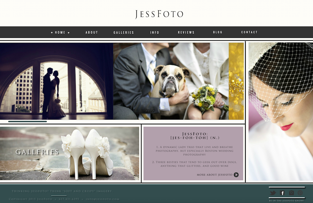
Identically to Y2K, Mobilegeddon came and went and we are all still standing. I am living proof that even with NO background in design and ZERO ability to use Photoshop except to resize and put a logo on a picture — you can make a website with Showit. In fact, that is the easiest part of revamping your site because their customer service is unparalleled in the industry. If you have a question, they have an answer. If you have an idea, they help to make it into reality. Truly, when I say if I can build a website using Showit, absolutely anyone can. That's why I have included a handy dandy little outline to help you get started if you have an established brand.
LDC's Guide to Creating a Killer Website
- What is the style of your brand? Find a template to match and save yourself the headache of designing a site from scratch (unless of course you are an incredible designer — but you wouldn't need to be reading this guide then)
- Choose your color palette.
- I cannot stress the importance of being unique but authentic in your design process. Make it a memorable and appealing site to your desired clientele but don't knock off another photographer's site in any way shape or form. Not cool.
- Learn SEO basics.
- Add alt text to your images. You can thank me later.
- Add your location and phone number even if you are paranoid about creepy stalkers. You don't need to list your actual address, just the city. And create a Google talk phone number.
- Combine your blog and website. Why? Refer back to learning about SEO basics.
- Give yourself a realistic completion time.
- Ask your friends/family for honest feedback. You know who to ask — the ones that have no problem telling you if you have a stain on your shirt or said shirt really does make you look fat. Their opinion in this situation is GOLD.
- Just remember, it will all come together in the end so have fun with it! Or have a glass of wine. That makes everything fun.
Lauren is the studio manager for JessFoto and she just launched her own wedding planning business like a minute ago. She has absolutely ZERO photography skills - BUT loves working in the world full of creatives!


