Load Newsreader Bold Font
I love the power of Showit plus WordPress for a website and blog. It's like a double roundhouse kick to the face for your SEO, and both platforms have such great perks for design and functionality. You may have noticed though that while Showit is fairly straightforward as far as designing your site, WordPress may not come quite so easily.
I would say WordPress is by far the most prominent blogging platform used by photographers, and I'd also say that Prophoto theme is probably the most widely used theme by photographers because it is easy to customize and doesn't require a lot of coding knowledge. They've made it incredibly user-friendly and it's definitely my favorite to work with. Other themes like Divi theme and even some of the free themes WordPress offers can also be good solutions for blogging themes. I like to describe a theme like wallpaper for your website. Changing your theme changes the look of your site and can sometimes change a little bit of how it functions, but changing your theme doesn't mean you will lose your posts, pages, or comments.
Now that you know a little more about themes, let's get to some basics about making your blog and site look like they go together, rather that like they are from two totally different photographers.
[dropcap]1[/dropcap]BRAND COLORS
This is probably the most common thing that I see when I look at blogs, lack of cohesion in brand colors. Your brand is your identifier, so if someone goes from your pink, black and gold website over to your gray and yellow blog, they may be completely confused about where they are and if they somehow clicked the wrong link somewhere along the way.
Be sure that you're grabbing your color codes and plugging the exact ones into your blog that you use in your site. Both Showit and WordPress use a hexidecimal color code system (#XXXXXX) to designate color, so you can easily carry the exact same colors over if you copy those colors. Making sure your colors are cohesive from one platform to the next will ensure that everything flows together well and that visitors know they are looking at the same person.
[dropcap]2[/dropcap]BACKGROUNDS AND GRAPHICS
This is probably the second most common one I see, and it's usually that people will use the default background that came with Prophoto theme because it kinda sorta somewhat matches their brand. Unless it matches your site, it's much better to get rid of it and either find the same background used in your Showit site or use a solid color. Even a white background is better than using something that looks out of place.
If a default element doesn't fit, get rid of it.
[dropcap]3[/dropcap]FONTS
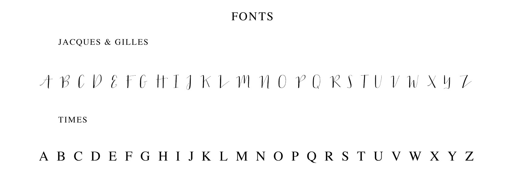
The third most common element that I see not carried over from website to blog is custom fonts. First, I'd say make sure you're using fonts that you have the proper rights to use for commercial use and embedding, and then make sure that you use the same ones on your blog as you do on your website. Prophoto and other WordPress themes have many of the same default fonts that Showit does, which can be used for commercial projects.
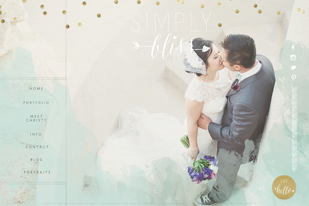
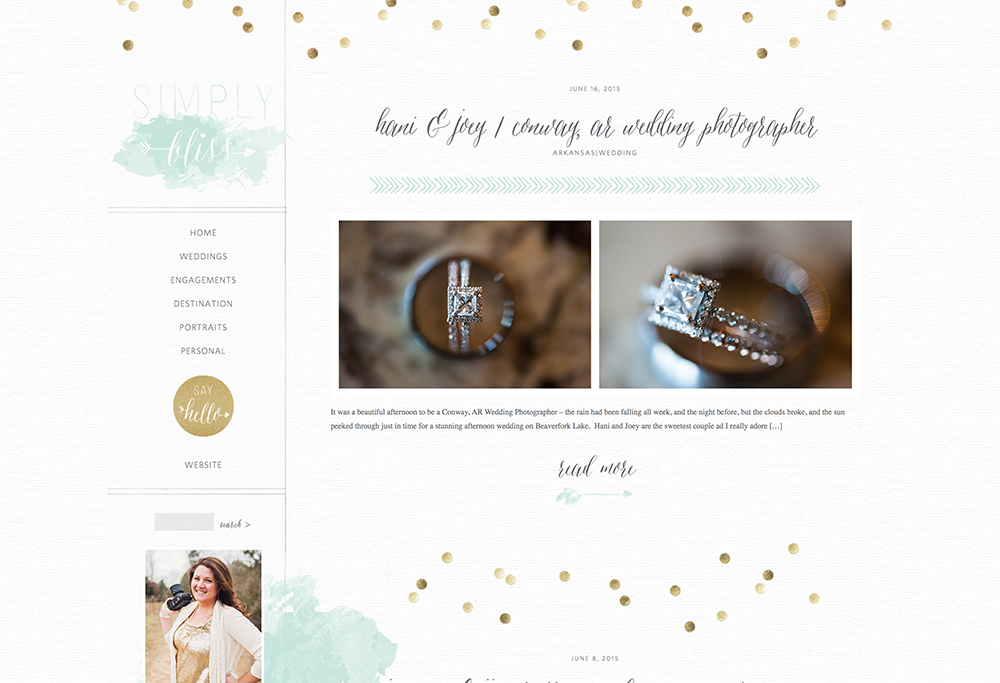
 Both of the screenshots above are from branding boards that I give to my clients upon completion of their branding projects. You can absolutely feel free to create one of your own so that you can have your brand elements right in front of you to make sure that you always remember what colors, fonts, and graphics to use to keep your web presence (and in turn, brand presence) cohesive no matter what platform you are working with.
Rachael Earl is the owner and lead website designer at Earl & Layne, and is a Showit Design Partner. She has been using Showit to design websites and online identities for creative professionals since 2009, and is also a professional photographer. Rachael has been married to her amazing husband since 2000, and they have 4 incredibly adorable offspring together. They call Gilbert, Arizona their home, which is affectionately and alternatively known as "the surface of the sun."


