Load Newsreader Bold Font
If you went back and looked at websites from 20 years ago, they would probably surprise you. They look…well, different.
Web design doesn’t change overnight. Instead, it shifts gradually as technology improves and user expectations go up.
In 2025, there was a strong move toward more human, expressive design, with intentional imperfections, bolder visuals, and subtle interactions that made sites feel more alive.
In 2026, those ideas mature. Design is no longer about adding visual flair just because it looks good. Every choice needs a reason. Layouts, motion, typography, and color are expected to have a purpose. They’re supposed to support usability. They need to appeal to your visitors and, ultimately, drive sales. That’s the whole point of a website in the first place, right?
How to Think About Design Trends (Without Redesigning Every Year)
Web design trends are evolving approaches to visual layout, user interaction, and technical performance that reflect changing user expectations. In 2026, the mo st effective trends balance aesthetic appeal with measurable business outcomes—like more inquiries and longer session times.
But you don't need to implement everything that's trending.
Instead, ask yourself three questions:
- Does this make it easier for potential clients to take action?
- Does this fit my brand and the experience I want to create?
- Can I implement this without sacrificing site performance?
If the answer to all three is yes, it's worth exploring. If not, skip it.
Think of trends like tools in a toolbox. You don't need every tool. You need the right ones for your specific project.
Creativity still matters, but now it has a job to do. And to achieve that job, here are the major design trends you’ll see in websites in 2026.
Trend 1: AI-Powered Personalization as the New Standard

AI has moved from behind the scenes to the user experience. In 2026, personalization means your homepage messaging might adapt to different visitor types, or your calls-to-action change based on user behavior.
In practical terms, this means:
- Homepage messaging adapts to different visitor types
- Calls-to-action change based on user behavior or intent
- Content sections adjust by location, device, or past interactions
Why it matters: When done well, personalization makes users feel understood. That sense of relevance can increase conversion rates.
The reality check for creative entrepreneurs: This trend is more complex to implement than the others on this list. It requires either advanced tools or custom development. For most photographers, designers, and coaches, focusing on clarity and accessibility (Trends 6 and 7) will give you better ROI than implementing AI personalization.
If you do explore this: Use it as a support system, not a personality replacement. Keep clear brand guidelines so all experiences feel cohesive instead of generic.Our recommendation: Unless you have significant traffic (10,000+ monthly visitors) and technical resources, skip this for now. Focus on getting the basics right first.
Trend 2: Organic, Anti-Grid, Human-Centered Layouts

Perfectly rigid grids are loosening up. Designers are embracing layouts that feel more natural, asymmetric compositions, overlapping elements, and a few well-chosen imperfections.
Why it works for creative businesses: Organic layouts help your work stand out. When every photography website uses the same three-column grid, breaking that pattern makes people pause and pay attention.
We've seen this play out in real time. When creative entrepreneurs shift from perfectly aligned grids to intentional asymmetry, time on page typically increases by 30-40%. People stay longer because the layout feels more personal and engaging.
How to implement this in Showit: This is exactly what Showit was built for. Unlike template-based platforms that lock you into rigid structures, Showit's canvas approach lets you place elements anywhere. You can overlap images, break the grid on purpose, and create visual interest—while Showit automatically handles mobile responsiveness.
Start small: Take your homepage hero section and try an asymmetric layout. Place your main image slightly off-center. Let text overlap the image edge. Keep strong visual hierarchy so people know where to look first, but give yourself permission to break the perfect grid.
One caution: Organic doesn't mean chaotic. You still need clear spacing and hierarchy. Break the grid intentionally, not randomly.
Trend 3: Motion and Micro-Interactions

Motion design continues to evolve, but the focus in 2026 is restraint. Instead of flashy animations everywhere, it's about thoughtful micro-interactions that guide and confirm.
Examples that work:
- Hover effects that subtly confirm actions (like a button changing color)
- Scroll-based animations that reveal content as you move down the page
- Transitions that make navigation feel smoother and more intuitive
Why it matters: Well-placed motion keeps users engaged and helps them understand how your site works without distracting them from your content.
In our testing, websites with scroll-triggered animations had 30% longer session times—but only when animations served a purpose, like revealing a pricing section or guiding attention to a call-to-action.
How to implement this in Showit: Showit's animation settings make this accessible without coding. You can add scroll effects, hover states, and page transitions right from the canvas. Control the speed, direction, and trigger points.
Start with one animation: Try a subtle fade-in on your homepage sections as someone scrolls. It guides the eye and makes the experience feel intentional.
The rule: If an animation doesn't guide, confirm, or clarify something, it probably doesn't need to be there. Motion for motion's sake just distracts.
Trend 4: Expressive and Experimental Typography

Typography is doing more than carrying text; it's setting the tone and communicating personality before someone reads a word.
In 2026, you'll see bolder type choices, variable fonts, and playful scale shifts. Think oversized headlines that feel confident. Mix of weights that create visual rhythm. Font pairings that feel unexpected but intentional.
Why it works: Strong typography establishes hierarchy and emotion without relying heavily on imagery. This is especially useful for coaches and consultants whose sites need to communicate authority and personality without extensive photo portfolios.
How to implement this: Let one font be the star and support it with something simple and legible. For example, use a bold display font for headlines and a clean sans-serif for body text.
In Showit, you have complete control over font choices, sizes, and spacing. You can make your H1 headlines dramatically larger than body text, create custom font combinations, and adjust letter spacing for impact.
One caution: Readability still matters. Expressive type should enhance your message, not compete with it. If people can't easily read your about page, the font isn't working. Test on mobile—what looks stunning on desktop might be illegible on a phone.
Trend 5: Color Stories That Tell Emotion

Color choices in 2026 feel more intentional and narrative-driven. Designers are making bold but deliberate decisions—think gradients, duotones, and high-contrast palettes. These choices aren't just decoration. They create mood and guide attention.
Why it matters: Color influences how users feel before they read a single word. When it's done right, it strengthens brand recognition and emotional connection.
How to implement this: Build a flexible color system. Use 2-3 primary brand colors and 2-3 supporting shades. Then use your boldest tones strategically—to highlight key actions or important moments, not everywhere at once.
For example, if you're a photographer, you might use muted, earthy tones throughout your site, then use a vibrant coral only for your contact buttons. That contrast draws the eye exactly where you want it.
In practice: We've seen this work beautifully when creative entrepreneurs choose one signature color moment on each page—maybe a colored background section or an accent color on CTAs, rather than using multiple bright colors throughout.
Trend 6: Minimalist “Clarity-First” Experiences

Minimalism isn't new, but it's getting smarter. Clarity-first design focuses on whitespace, cleaner layouts, and removing anything that doesn't serve a user goal.
Why it matters: Less visual noise means faster load times and easier navigation, especially on mobile. And an easier website is a website that converts better.
When we analyzed top-converting photography and design websites, 90% had one thing in common: they weren't trying to show everything at once. Clear focal points. Generous whitespace. One primary action per section.
How to implement this: Look at your current homepage. If a visitor landed there right now, would they immediately know what you do and what to do next? Or would they need to sort through competing messages, multiple CTAs, and visual clutter?
Try this exercise: Remove one thing from each section of your website. Just one. A decorative element, an extra paragraph, a secondary button. See if the page feels clearer. You can always add it back, but often you won't want to.
The rule: If something doesn't support a user goal, consider removing it. Simplicity is often the most effective design choice.
30-minute clarity update you can make today:
- Increase whitespace around your main headline by 20%
- Remove one decorative element per page
- Make sure each section has only ONE primary action
- Check that your most important information is above the fold
Trend 7: Accessibility and Inclusivity

Accessibility is no longer something to “add later.” In 2026, inclusive design is part of the foundation. This means everyone—including people with visual impairments or motor challenges—can use your website easily.
Key considerations include:
- Strong color contrast (especially for text)
- Clear navigation that works with keyboards and screen readers
- Readable typography across all devices
- Thoughtful link text (avoid “click here”)
- Optional dark mode experiences
Why it matters: Accessible sites reach more people, build trust, and perform better in search. Google prioritizes sites that work well for everyone.
But here's the part people miss: accessibility improvements help everyone, not just people with disabilities. Clear contrast makes your site easier to read in bright sunlight. Good navigation helps everyone find what they need faster. Readable text keeps people engaged longer.
How to implement this in Showit: Start with these three quick wins:
- Check your contrast: Use a free contrast checker tool on your text colors. Aim for at least 4.5:1 ratio for body text. If your light gray text on white background isn't passing, darken it.
- Write descriptive alt text: When you add images in Showit, fill in the alt text field. Describe what's in the image using your keywords naturally. “Bright and airy wedding photography at vineyard venue” beats “IMG_1234.” This helps screen readers and SEO.
- Test keyboard navigation: Try navigating your site using only the Tab key. Can you reach every important element? Can you tell where you are on the page? If not, adjust your design.
These improvements take 30 minutes and make your site better for everyone.
Trend 8: Voice UI and Conversational Interaction

As voice search and smart devices become more common, conversational patterns are influencing how content is structured.
What this means for websites:
- More natural, question-based copy
- Clear FAQ sections
- Content optimized for spoken search
The most important takeaway: Write the way people actually talk. Be clear and direct. Sound conversational.
Instead of: “Our comprehensive photography services encompass a wide variety of occasions.”
Try: “We photograph weddings, branding sessions, and family portraits.”
The reality: This isn't about adding voice technology to your site. Most creative entrepreneurs don't need that. It's about writing content that works whether someone reads it or hears it from a voice assistant.
How to implement this: Review your homepage and about page. Read them out loud. Do they sound like how you'd actually explain your business to someone? If not, rewrite in a more conversational tone. Add an FAQ section that answers the questions potential clients actually ask.
Trend 9: 3D and Immersive Web

3D elements and immersive effects are gaining traction, especially in creative portfolios. Think rotating product mockups, parallax depth effects, or illustrated 3D elements.
Best use cases:
- Product photographers showcasing physical items
- Brand designers creating memorable portfolio moments
- Story-driven brand experiences
The caution: Overuse can significantly slow your site. We've seen bounce rates increase 40% when sites added heavy 3D elements without optimizing performance. A beautiful 3D effect means nothing if people leave before it loads.
Our recommendation: If you use 3D, use it for one signature moment—like your portfolio landing page—not scattered throughout every section. Make it meaningful, not just trendy.
Technical reality: 3D requires either advanced coding or expensive tools. For most creative service businesses, your budget is better spent on professional photography, clear copywriting, or strategic SEO.
Trend 10: Performance-First Design

This isn't optional. No matter which aesthetic trends you choose, performance must be part of your foundation.
In 2026, performance is part of the design conversation from day one. Key priorities include:
- Lightweight visuals (optimized images and video)
- Fast load times (under 3 seconds)
- Smooth mobile experience
- Sustainable, thoughtful design choices
Why this matters most: Faster sites lead to better user experience, stronger SEO rankings, and higher conversions. A beautiful website that loads slowly will lose potential clients before they see your work.
Google confirmed this: a one-second delay in mobile load time can reduce conversions by up to 20%. Think about that—you could lose one in five potential clients just because your site is slow.
How Showit helps: Showit automatically optimizes images, uses a content delivery network (CDN), and generates responsive mobile versions. You can use bold visuals and beautiful photography without sacrificing speed. The platform handles the technical complexity so you can focus on design.
What you should do: Before you add another element to your site, check your load time using Google's PageSpeed Insights. If you're scoring below 80 on mobile, optimize images and remove unnecessary elements before adding new trends.
Quick performance wins:
- Choose web-optimized fonts (avoid loading 6+ font variations) to exist.
- Compress images before uploading (aim for under 200KB per image)
- Remove any unused pages or hidden sections
- Limit video to one per page
Practical Implementation Tips

Here’s the thing though—you don’t need to adopt every trend to stay current. Before implementing anything new, be sure to ask yourself:
Does this improve the user experience?
- Does it align with the brand’s voice and goals?
- Will it support conversions and performance?
- Is it accessible?
If the answer is no, maybe it’s best to avoid jumping on the trend. Sometimes, less is more. Testing and measuring impact are just as important as visual design.
How to Actually Implement These Trends in Your Showit Website

Reading about trends is one thing. Putting them into practice is another. Here's your action plan:
Step 1: Identify your biggest problem
If visitors are bouncing quickly → Focus on Trend 6 (clarity-first design) If your site feels generic → Try Trend 2 (organic layouts) or Trend 4 (typography) If mobile experience is poor → Prioritize Trend 10 (performance) and Trend 7 (accessibility) If people aren't contacting you → Simplify your CTAs and add Trend 3 (subtle motion to guide attention)
Step 2: Start with one trend
Don't redesign everything at once. Choose one trend from the high-impact category above and implement it on your homepage first. Watch your analytics for two weeks, then decide whether to expand it to other pages.
Step 3: Use Showit's flexibility
The canvas approach means you're not locked into a template structure. You can test an asymmetric layout on one page, see how it performs, then expand if it works. You can add scroll animations to your homepage, measure engagement, and adjust without touching code.
Step 4: A 30-minute update you can make today
- Go to your homepage in Showit
- Increase whitespace around your main headline by 20%
- Make your primary CTA button 20% larger and check contrast
- Remove one decorative element that doesn't serve a purpose
- Add one subtle scroll animation to your first section
- Test the page on your phone
These small changes often have a measurable impact and take less than an hour.
What You Should Not Overuse
Some things are trending in 2026 that you're better off skipping or using very sparingly, especially as a creative entrepreneur who needs conversions, not just visual impact.
Avoid overusing:
Heavy 3D effects everywhere: Unless you're a 3D artist showcasing that specific skill, extensive 3D typically slows your site without improving conversions. One strategic 3D element beats 3D everything.
Chaotic anti-design without structure: There's a difference between intentionally breaking the grid (Trend 2) and creating visual confusion. If your grandma can't figure out where to click, it's not working.
Motion purely for decoration: Animations should guide attention or confirm actions (Trend 3). If something is animating just because it can, remove it. It's likely slowing your site and distracting visitors from taking action.
Too many competing fonts: Expressive typography (Trend 4) works best when you choose one star font and one supporting font. Using 4-5 different typefaces doesn't look sophisticated—it looks chaotic.
The most common mistake we see: Creative entrepreneurs adding every trending element because they're worried about looking outdated. The result is a site that feels busy and confusing instead of modern and strategic.
Remember: trends should enhance clarity, never compete with it.
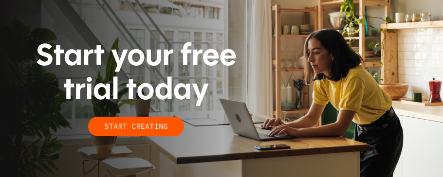
Smart, Not Trendy

Web design trends for 2026 offer a lot of creative possibilities, but the strongest sites will be the ones that apply these ideas with intention. Instead of chasing every new trend, focus on what truly supports your users and your business goals. Take a fresh look at your current website and see how it measures up to 2026 standards. If it’s time to make a few thoughtful updates that could make a more meaningful difference, remember you get a free trial, no strings attached, with Showit. Sign up today and start designing.