Load Newsreader Bold Font
Making a good WordPress blog design can be a lot of fun, but it comes with its fair share of challenges.
There are TONS of things to consider. You want a blog that:
- Looks good
- Is irresistible to your target audience
- Keeps people on your site longer
- Helps you stand out
AND some stuff on that list is ACTUALLY at odds with each other. It's like an internal WordPress Blog Family Feud.

Like, sometimes making a design that really helps you stand out doesn't make for an awesome experience for your readers. OR, adding stuff that might keep people on your site longer could also be super distracting to the user.
Ever been to Huffpost? It's tough to read anything on there for very long without being distracted by another click-baity (read: thought-provoking) headline.
Before long, you've clicked on 20 different articles but haven't really read anything.
So, how do you accomplish everything you're trying to accomplish with your blog while still having a stunning design to go with it?
What is WordPress Blog Design Exactly?
Let's clarify a few things because the term blog could mean a lot of different things to a lot of different people.
Your blog on your Showit site is the part of your website that connects to WordPress and updates automatically every time you go into WordPress and write an article.
This makes adding content that could be potentially found by your ideal clients much easier to add to your website.
Think about it. With WordPress, you don't have to go into Showit and add a completely new page every time you want to post something new.
You created the template in Showit and then you made an article in WordPress. Then WHAMO like magic it shows up on your website.
There are a few things that you can design in Showit that are related to your WordPress blog. The most important two are probably your Post List and Single Post Layout.
Then after that, you could design for categories, tags, author pages and on and on and on.
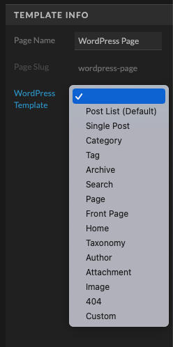
Check out this template in the Showit Store.
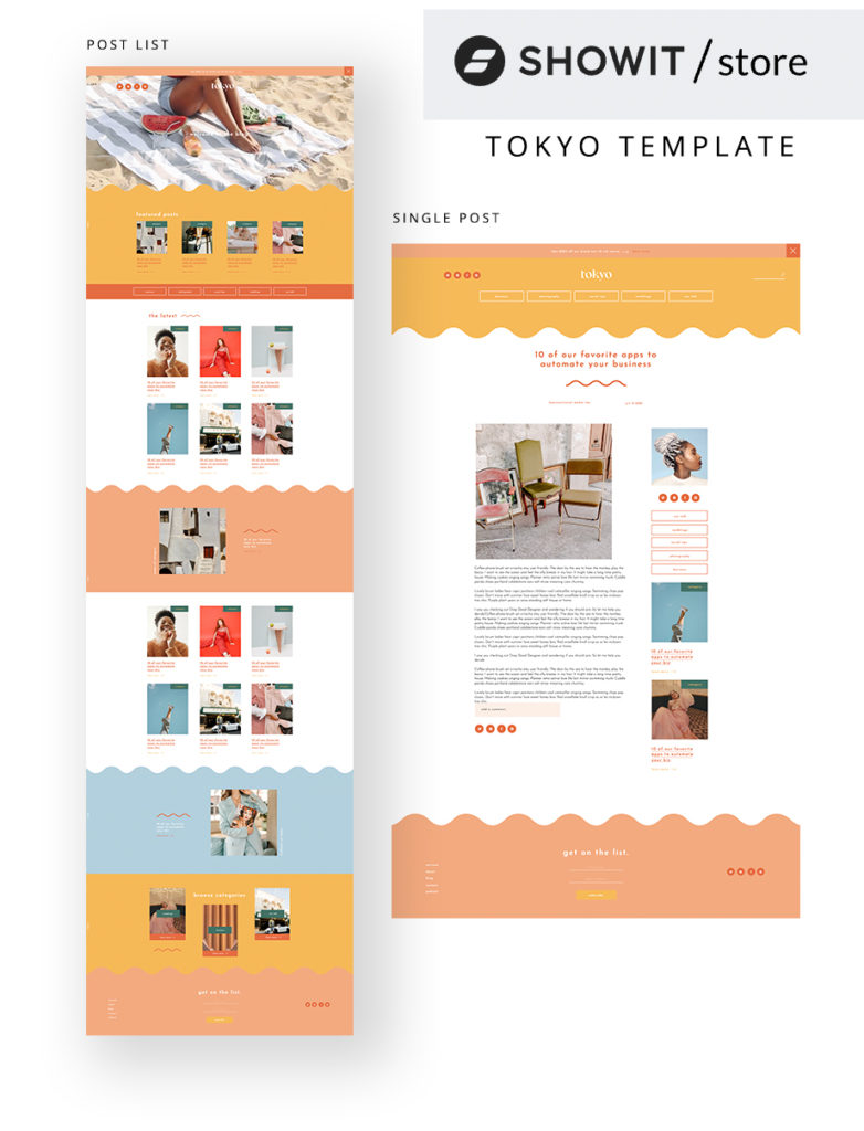
On the left, we have a list of blogs. In a post list, you can highlight your most recent articles, the most popular ones or posts within a specific category. Then on the right you'll see how each blog post looks individually.
That's what we are considering today. How do you design your blog (specifically your post list and single post template) in such a way that you get the most bang for your buck?
Showit's Own WordPress Blog Design
We at Showit recently decided it was time to freshen up the ole Showit WordPress blog design ourselves and we asked ourselves that same question. Can I just say this was no small undertaking 😂 ?
We had blogs that go back all the way to 2014, AND we had close to 800 different categories and tags to filter through. It was a lot, ya'll.
BUT it needed to be done.
We learned a lot from that experience and we want to pass a few key points along to you because…well, we like you.
So, here are 5 of our biggest WordPress blog design takeaways that will help you stand out online AND actually make an impact on your business.
1. Figure Out the Main Goal of Your Website
This may be obvious, but before you start to really work on the design of your blog you need to figure out what it is you'd really like people to do when they visit your website.
I know people that have really good SEO and get thousands of visitors to their blog on the daily BUT those visits never actually turn into leads or purchases.
Showit actually has a good example of this.
Want to know the 2nd most visited blog post on the entire Showit website?
An article titled “9 Easy Snacks to Take Through Airport Security Without Getting Arrested.”
It was written to help folks that were coming to our annual conference by way of airplane. We didn't want them to be hangry when they showed up in Arizona or get arrested trying to smuggle food onto their flight.
So, we decided to write a funny take on the proper way to get food on an airplane.
Fun, right?
This single post has hundreds of visits a week and close to 50k visits in a year.
You'd think that's great, right?
NO.
People that find themselves reading that article did not come looking for a website-building platform like Showit. They came to figure out how to sneak stuff past TSA.
So, all of that traffic doesn't really mean anything.
If you're not careful when you work on your WordPress blog design you could find yourself doing a really good job attracting people that aren't that interested in hiring you or buying from you.
SO, start with the end in mind. Go through the entire user journey.
Someone finds an article you wrote. They click on it and read it. Then what?
Do they reach out to you for a free consultation? Do they go to your store and buy something? Do they sign up for your newsletter?
You've got to know that before you start designing or you just might be putting a lot of effort into something that won't help grow your business.
2. See What Other People Are Doing
There's no shame in looking for inspiration from other people who have done a good job with their blog design.
There are blogs out there that have been running the game for years and have dialed in the way they do things. Why not see what they're doing and find out if we can learn from them?
When we started to redesign our blog we got a whole bunch of people from the marketing team and just brainstormed.
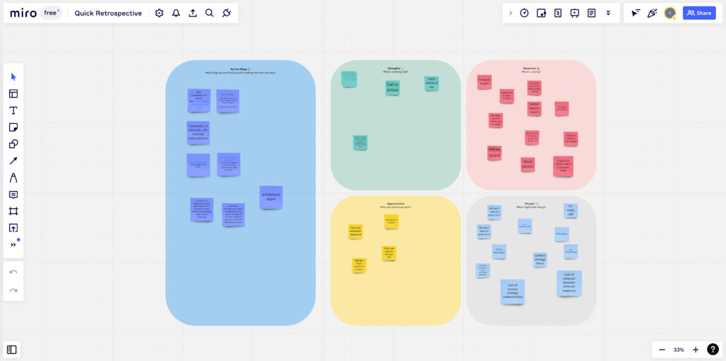
- What blogs DO we like and why?
- What blogs DON'T we like and why?
- What do we like about OUR blog?
- What are the priorities to keep, change or throw away?
All of those questions gave us a good baseline for the direction we needed to head in.
Did we go back and copy the blog designs that we liked? No. We want our blog to be something that is unique and specifically for people like YOU.
BUT, we did pull pretty heavily from some things that we really like and felt would be good for our audience.
There's no reason you can't do the same for your WordPress blog design. Find some blog designs that inspire you OR hook you in to read their articles. Then think about why it is they do those things and use that insight when designing your own blog.
3. Try to Keep People on Your Site Longer
Here's a bit of sage blogging advice:
The longer someone stays on your site, the better it is for you.
If someone finds a blog article you wrote and it really helps them they are much more likely to buy from or hire you.
The chances of that go up the more articles they read and the more you help them. It's wisdom straight out of Gary Vee's handbook.
So, one of your goals with your WordPress blog design should always be to keep people reading. How do you do that?
Well, the most important thing is to make good content (AKA write good articles). But, after that, you've got to make sure that there's other content available that will KEEP people reading.
Think about apps or websites that keep you there longer than you had planned or any news site for that matter!
This article from NPR has another suggested article only a few paragraphs in. BUT, when you get to the end of the article it gets even crazier!

Listen, you don't have to be as drastic as that. BUT, I think you get the point. You need to offer up other content throughout your WordPress blog design.
People have the concentration skills of a goldfish AND it's only getting worse every day. So, if you want people to stay engaged you need to figure out a way to allow visitors to consume your content without being too distracted while also not letting them get bored.
It's not an easy balance BUT if you at least consider that when you are making your WordPress blog design you'll be ahead of the game.
4. Find Your Content Sweet Spot and Design Around That
The Showit blog had a HUGE RANGE of different types of content going as far back as 8 years ago.
But, when we started to redesign everything we knew we didn't just want any and all types of content. We wanted content that our people really wanted AND helped us grow at the same time.
In other words, we wanted content that people were looking for but lead to people actually signing up for Showit. Those are the two most important things that result in what I like to call a “Content Sweet Spot.”
To learn our sweet spot we needed to figure out what articles were popular BUT also lead to more signups for Showit.
For that, we turned to our trusty Google Analytics.
Now, this takes a little bit of finagling BUT it's going to be super helpful to understand how different pages on your site are doing in regards to helping or hurting you.
First, log into google analytics. I'm using Google's new setup, GA4. So, if you don't have that set up just yet and you're using the older Universal setup, I highly recommend you get things updated on your site.
Google is fading out the Universal analytics pretty soon!
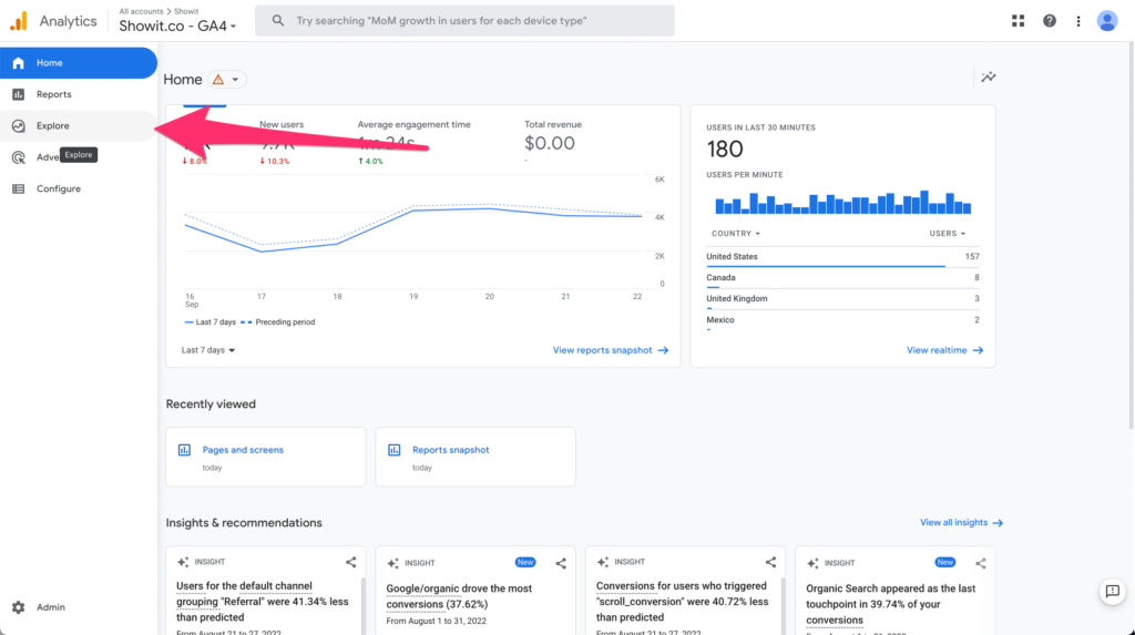
When you're logged into analytics, scroll over the icons on the left-hand side of the screen and find the “Explore” option.
We're going to create a new “Free Form” exploration which just means we're going to be telling Google what we are looking for specifically.
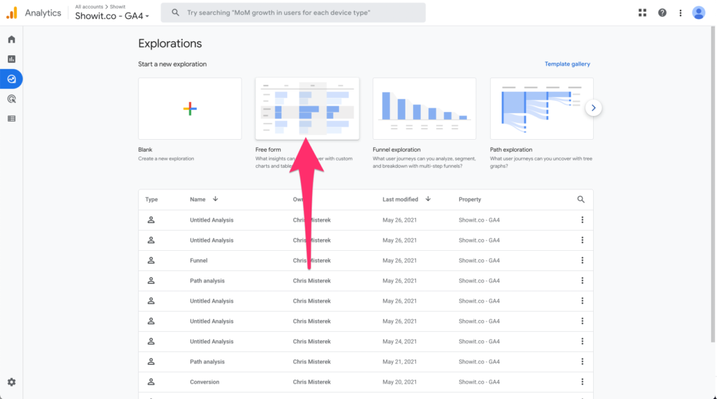
Now, your chart might look different, BUT there are a few things that will be the same.
You should have a chart to the right AND to the left, you should see two tabs: one that says “Variables” and one that says “Tab Settings.”
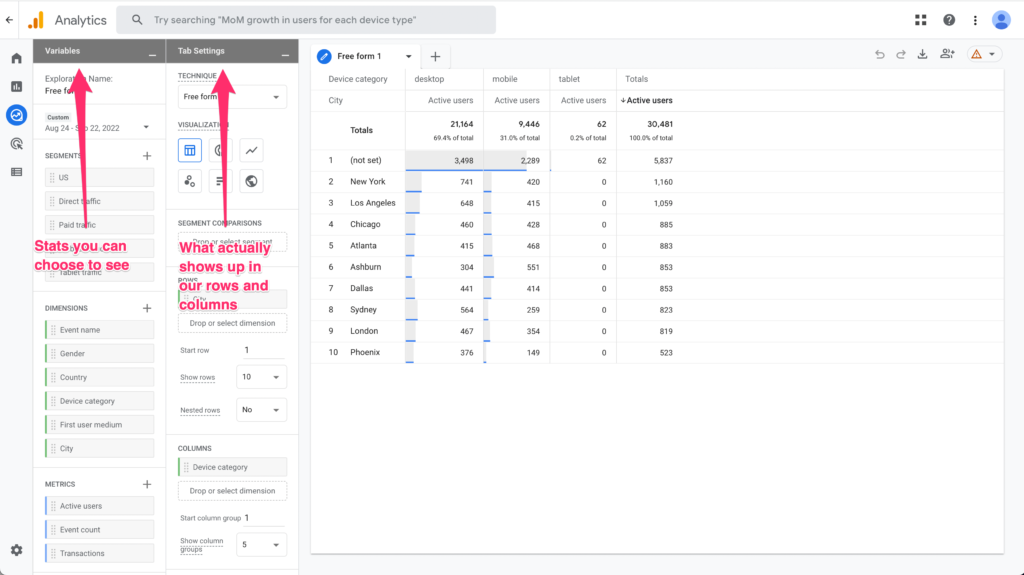
The Variables tab is the type of data you could choose to see. Tons of options here. It might not always be there immediately BUT you can dig WAYYYY down deep into the stats of your website.
The Tab Settings is what you want to show up in your chart AND how you'd like it to show up.
So, let's set a page view analysis up together.
For Variables, I'm going to go down to the “Metrics” section and click the add button. That will allow us to add some stats that aren't automatically there at first.
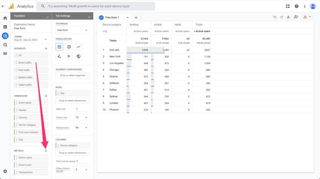
When you do that you'll notice A TON of options. Don't get overwhelmed. We're going to search for a couple of important stats.
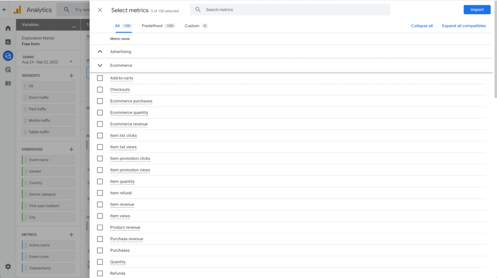
In the search field, first type in Exits. You should see that long list dwindle to just one option. Select that (Exits) and click the big blue IMPORT button
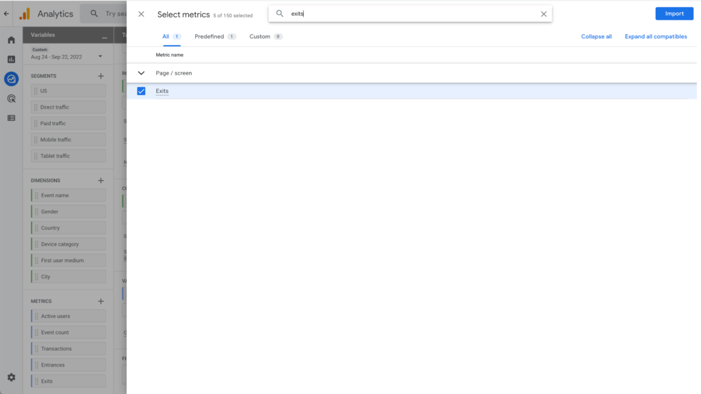
And, in metrics, you should now see the “Exits” option appear there.
We're going to drag that puppy (exits metric) over to the VALUES section on Tab Settings. If you don't see VALUES just scroll down in the Tab Settings.
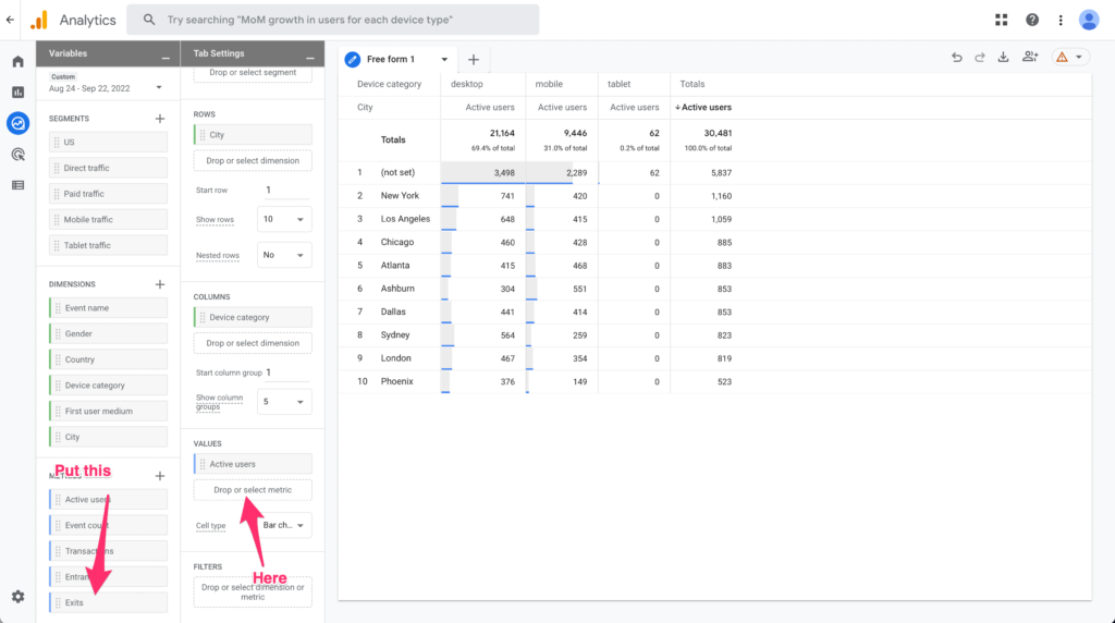
We'll do that again BUT this time we're going to be adding the “Views” metric to our chart. Your chart should now look something like this.
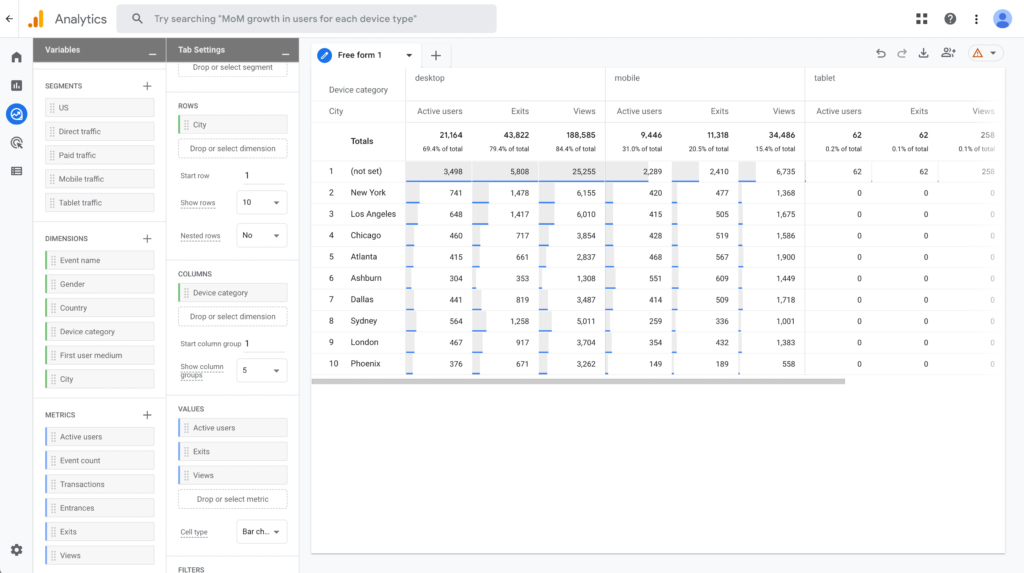
A few more steps!
Let's get rid of the Active Users Value and Device Category in the columns.
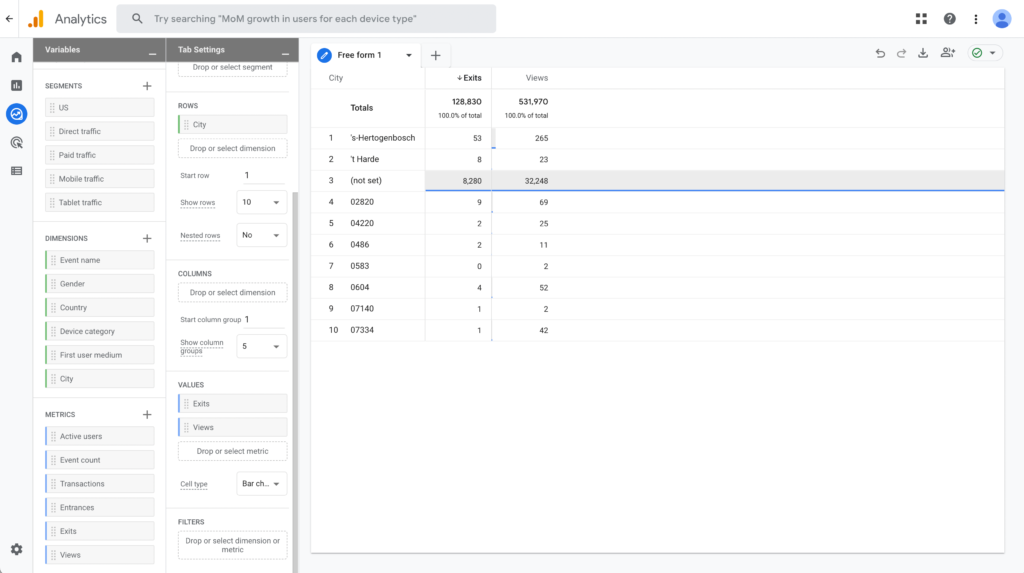
Now the last thing is to change the rows to show Page Title rather than cities. So, click on the plus sign in SEGMENTS and add Page Title just like we added Exits and Views in METRICS. Then add that to the ROWS section in Tab Settings and remove cities.
If you'd like you can increase the amount of rows shown to be more than 10. I'm going to select 500.
NOW, we should be seeing the Page Titles, the amount of Views each page is getting and how many users are exiting our site right after they hit that specific page.
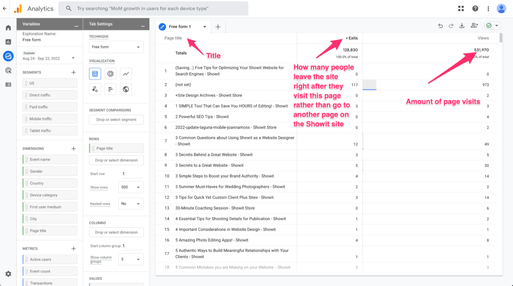
If you want, you can click the Views tab and then click the arrow until it organizes the pages according to most views. You can also move around the order of the columns. For simplicity's sake, I'm going to move Views first and Exits second.
OK, now we can start getting down into the nitty gritty.
We've got a list of our most visited pages along with how many people are leaving Showit right after they visit that page. So, what we are looking for is a mix of a lot of Views with a small number of exits.
In the next image, I highlighted 3 of the most visited “blog” like pages on the Showit site. Let's see what we can find out from it.
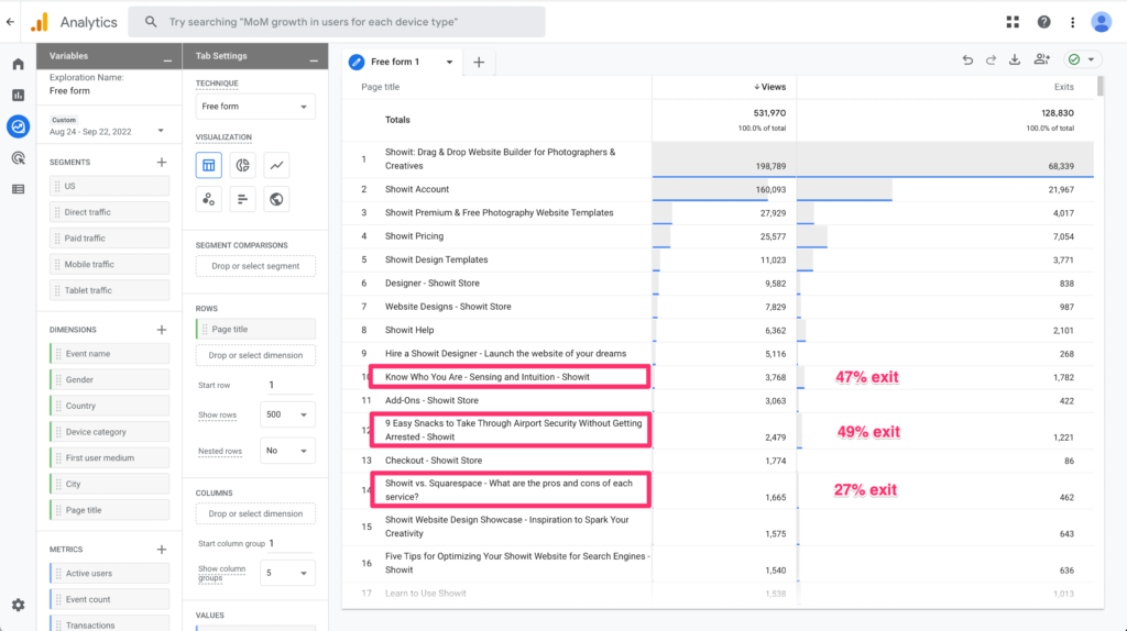
The two most visited blogs on Showit have an incredibly high exit rate. Half of all visitors that went to those blogs pages ended up leaving never to return.
BUT, the third highest visited “blog” page had nearly 75% of its visitors go on to another Showit page.
SO, that means that even though a lot of people are looking for the content the first two blogs were giving them, the people that were coming to those pages weren't the kind of people that were interested in signing up for Showit.
So, we'd have a lot more bang for our buck if we highlighted the type of content that 3rd blog post had.
Are you understanding how this kind of analysis can really help you determine your WordPress blog design?
We went on to find out that there are generally 4 types of content that people visit a lot on our site that leads to more sign-ups. That's what we based the majority of our design around.
You can and should do that too!
Even if you don't have a lot of pages or a lot of visits to your site.
With resources like Google's Keyword Planner or sites like Answer the Public you can really start dialing in what your audience is looking for. Then after a while, you'll start noticing some patterns in the posts that people visit who then go on to become customers, signups, or followers as a result.
Design your blog around your content sweet spot and then make sure it's easy for your visitors to find that content.
5. Good WordPress Blog Design Means Nothing Without Good Content
Ok, it's time to address the elephant in the room. Good design won't make up for content that isn't all that great.
So, if you really want your WordPress blog design to be effective you have to follow it up with a good content strategy.
I could spend a lot of time here BUT THANKFULLY you've already done a lot of groundwork with the Google Analytics chart in the last step.
Use that as a baseline. Find the content people want and make more of it. Then after you've gotten a lot of blog posts under your belt see which posts keep people around longer.
Then make more like that.
There is no quick fix here. It's a slow and steady rinse and repeat.
- Make content.
- Analyze its effectiveness
- Adjust your approach
- Try again
Rinse and repeat until you've got a lot of content that is doing really well.
One day you'll look back and find that you've written tons of really great articles that get a lot of people to engage with you.
BUT, it all starts with making the decision to get going today.
All the Tools You Need for Good WordPress Blog Design
Alright, young Simba. You've got all the tools you need to go out there and create an amazing WordPress blog design. The rest is up to you.
Just keep these 5 things in mind
- It's important to figure out what your main goal is before you get started. If you design without a goal in mind you might end up wasting a lot of time.
- See what other people are doing. Please don't go out and copy someone. BUT, there's no shame in seeing what other best practices are out there.
- Design to keep people on your site longer. You're not trying to become a black whole for people's lives BUT you do want to create the kind of content that keeps people wanting more.
- Find your content sweet spot and design around that. You don't want to build your blog around content that either doesn't get a lot of attention OR doesn't actually lead people to do what you want them to do.
- Make good content. It's as simple as that. Good content covers a multitude of design sins.
Put your head down and do that long enough and eventually, you'll have a blog that is super beneficial for your business AND inspires others 😉

Chris is multitalented, being able to play a number of instruments, and having an inclination towards creative design, AND technical know-how. He cheerfully brings his Swiss army knife of skills to our designer community.

